7 Secrets for Decorating with Neutrals That Are Anything But Boring
Inside: When decorating with neutrals, it’s easy to end up with a room that’s bland. I’m breaking down key decorating tips that will help you turn a ho-hum room into a gorgeous anything-but-boring space! ➡
Imagine you’re watching an old-school beauty pageant.
It’s come down to two girls who want to be chosen so badly they can taste it.
The first one is everything you think you want to be if you had a magic lamp. Gorgeous, of course. Glamorous, vivacious, the life of the party. She commands all the attention.
You feel bad for that second girl – quiet, subdued, fading into the background. Your basic wallflower.
The big moment comes and you would bet the farm that annoyingly bubbly, flawless contestant has it in the bag.
But whaaaat??? The crown goes to –
Miss Vanilla Bland Boring! 👑
You might be thinking, “that’s great and all, but I’m here for decorating advice?”
Stay with me because this is why the wallflower won:
Because boring and basic is best!
I’m of course talking about decorating. You may need to be a little extra to win a pageant crown. But when it comes to interior design, team neutral is a winner.
This post contains Amazon and other affiliate links for your convenience. As an Amazon Associate I earn from qualifying purchases. If you purchase something through any link, I may receive a small commission, at no extra charge to you. I only recommend products that I love or would purchase for myself. See my full disclosure here.
Why you should decorate with neutral colors.
Even if you LOVE color and think, “I could never live in a room devoid of color“, let me make the case for why even you should consider decorating with neutrals. If only as a blank canvas for your beloved color!
A neutral color palette helps different styles work together successfully.
A basic rule of interior design is that you should mix in elements of other decorating styles to up the interest level of a room. Unless you are an interior decorating master, keeping the differing styles in the same color palette helps them to “go”. That modern ivory chair and traditional taupe sofa can make a lovely couple!
Decorating with neutrals saves you dollars.
Colors follow trends and date rooms quickly. When you remove colors other than
neutrals from everything but your accessories, it removes the time stamp. You won’t need to replace large ticket items like furnishings, rugs, and drapes as often.
You’ll notice an immediate change if you take out outdated trendy color combinations – like the “old world” red/brown/gold so popular in the early 2000s.
Change the color palette and mood in a room with just a few accessories.
A neutral color scheme provides a perfect backdrop that allows a quick change in color palette or mood. Color devotees, this is where your color comes in and it will have all of the spotlight! (More about that further down so stay tuned…)
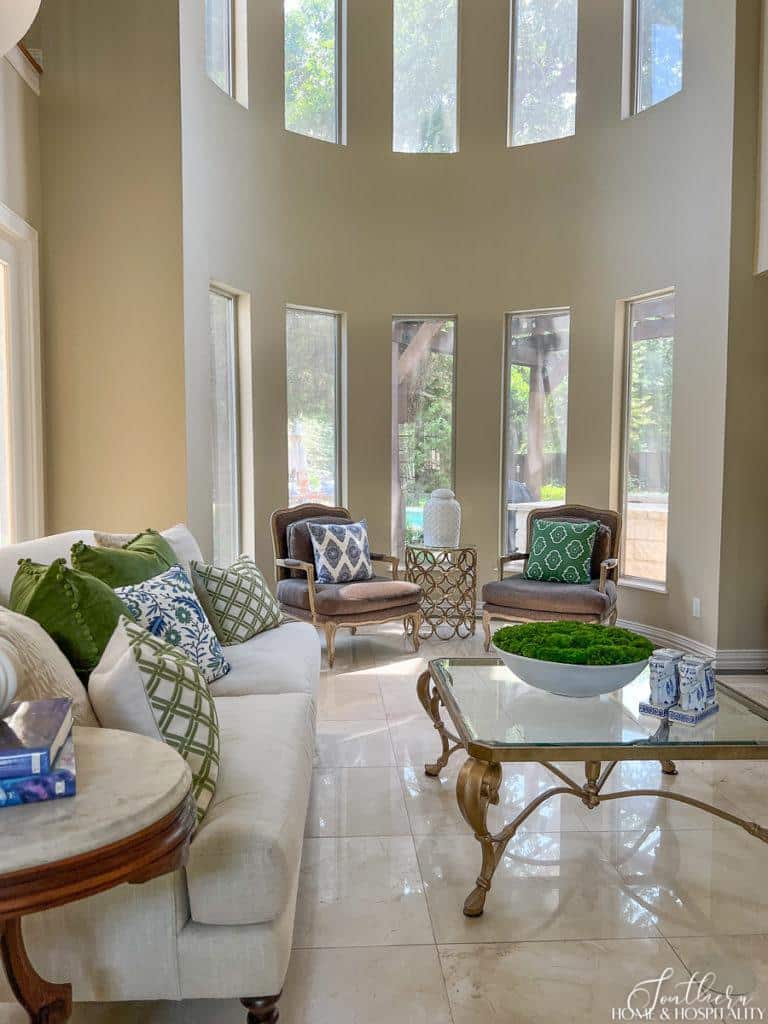
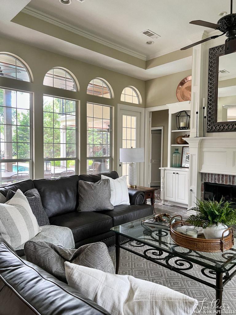
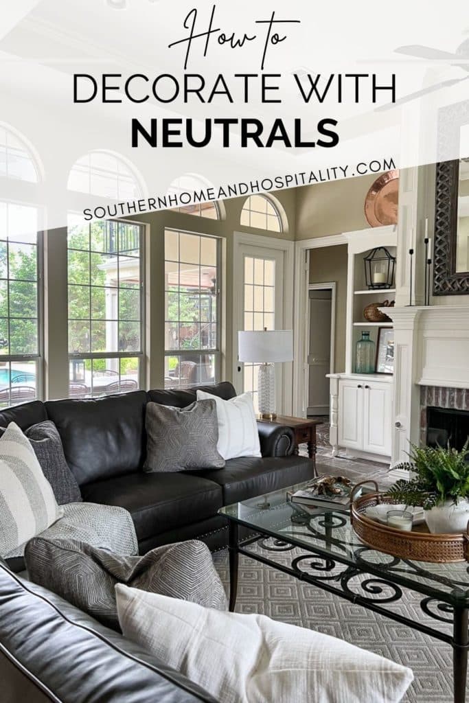
My neutral living room sofa and chairs are prime candidates for seasonal looks. Just a change of throw pillows is a super easy way to makeover this room in a snap for the different seasons. Here they’re wearing their summer ensemble with pops of color in green and blue.
Neutrals make rooms flow.
Designing your home based on a neutral scheme keeps the rooms from having a jarring disconnect. We have the same neutral paint colors throughout our living room, dining room, kitchen, and family room and it’s a great way to create a cohesive look in our home’s open floor plan.
Light neutral colors will make your room feel up to date.
Adding neutrals in lighter shades will really brighten and freshen things up in a room! Even a dark, cozy space needs some contrasting lightness not to feel old, depressing, and claustrophobic.
What are the main neutral colors I can work with?
If you think, “I can’t realistically live in an ‘all white‘ room”, there are a whole rainbow of colors in the neutral fan deck to choose from!
Light neutrals range from shades such as white, cream, oatmeal, and sand.
Darker neutrals include taupe, tan, and dark gray. Chocolate brown and coffee are lovely warm neutrals on the dark side.
Cool neutrals include platinum, dove gray, charcoal, and iron. Even black is a neutral. And then there’s that so perfect, all-purpose color “greige”!
The sofa in my family room is a dark neutral instead of the expected cream color, which makes it much more family-friendly with daily dirt. And I never get tired of the color.
Neutral color undertones.
Okay – neutral colors are not totally neutral. They have undertones that you’ll need to be aware of and that can change depending on what kind of light the room gets.
Even what you think are going to be safe white or beige walls, tend to have a yellow or pink tone. So when picking a neutral wall color, figure out that undertone before you commit to having it all over your walls.
Neutral tones are more timeless if you stay in the middle range of the warm/cool spectrum. Think of how golden honey oak and reddish wood looks dated. And the gray woods that are the rage right now will also see their day.
So strive to straddle the extremes with your big ticket items like wood floors and furniture if you want your neutral decor to have staying power.
How do you decorate with neutral colors?
Neutrals have a bad rap for being the “safe” choice and looking flat and uninspired. And if you aren’t confident in your decorating skills, you may think it’s what you should go with just because it requires the least decision-making and matching.
Beige and white. Boom. Done.
It’s not quite as simplistic as this. But it’s not difficult either to create a dazzling room without “color” if you use these seven key rules for decorating with neutrals:
1. Vary the colors and shades of the neutrals.
The first few rules all deal with creating interest and complexity in neutral spaces by adding variation – with different colors, shades, textures, materials, and shapes.
Since color doesn’t provide the interest, you can help bring it in with contrast and various shades of neutrals.
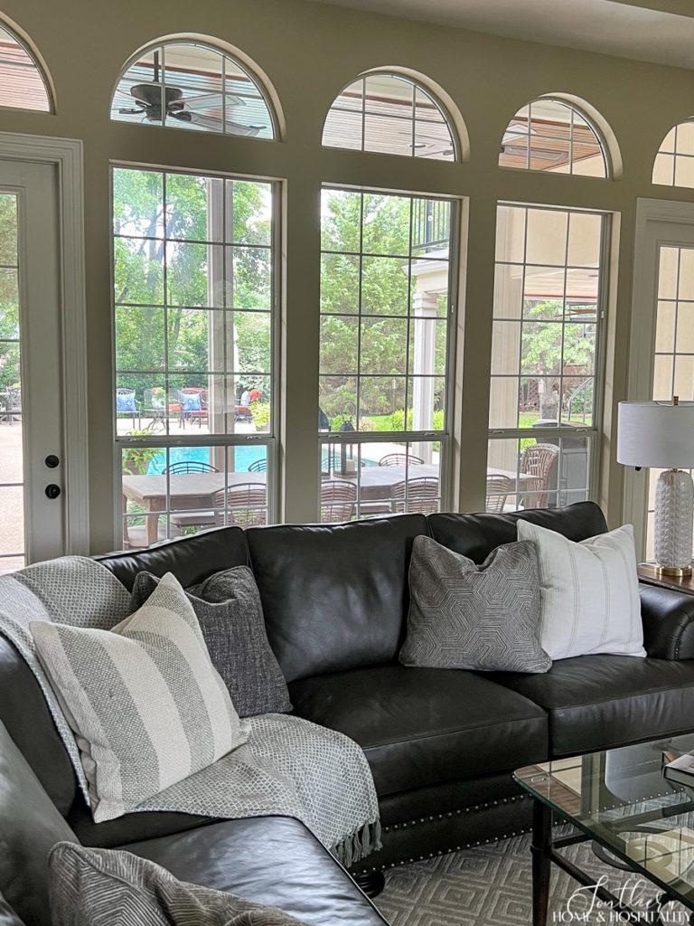
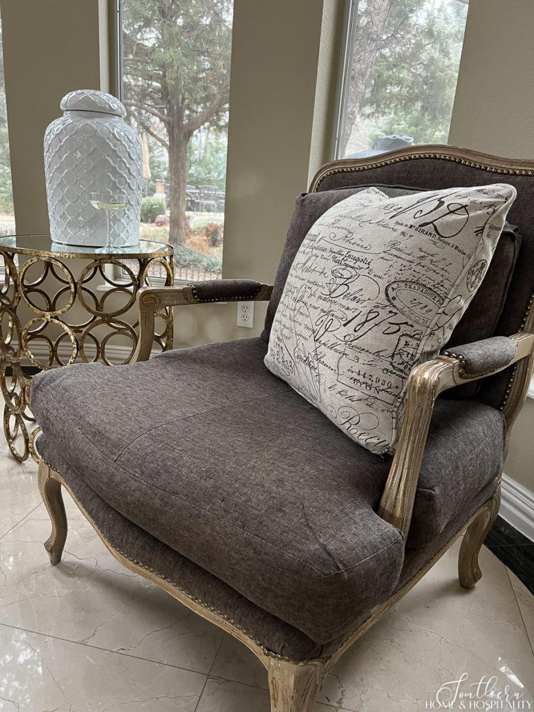
As you read above, neutral hues aren’t confined to beige and white. Work in black, gray, tan, and brown to add depth to a one-dimensional beige color scheme.
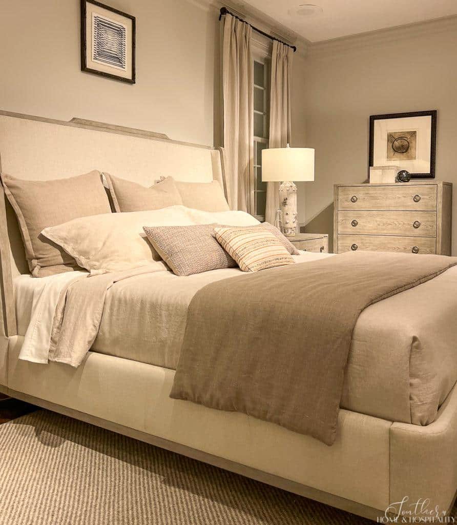
This bedroom arrangement would be so much more interesting and inviting with the addition of some darker and lighter colors. It’s a little too restful.
Rooms read flat and bland if you don’t have enough contrast in the colors. All blond woods and cream are so blah until you add in some rich darker colors. Always make sure and include a combination of light, medium, and dark shades.
2. Use lots of different textures and tone on tone pattern.
Go crazy with different textures. They will all play together well because they are neutral!
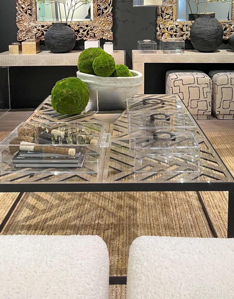
Everything in a room has a texture whether it be smooth, nubby, shiny, velvety, woven, furry, matte, shiny, leathery, or whatnot. So make sure to include a wide variety of all of these textural elements.
Metal brings even more interesting textures and neutral colors to the mix. So layer in metallics with some iron, brass, chrome, etc.
3. Incorporate unusual and contrasting shapes.
Without color, your eye searches for something to keep it entertained. Break up the boringness with the visual interest of curved furniture, architectural detail, and unique accessories.
4. Add a bit of black.
A touch of black in any room is a trick from the interior designer’s toolbox. And black accents are extra divine and sophisticated in a neutral room. I’m so completely infatuated with the current trend of black doors and window trim!
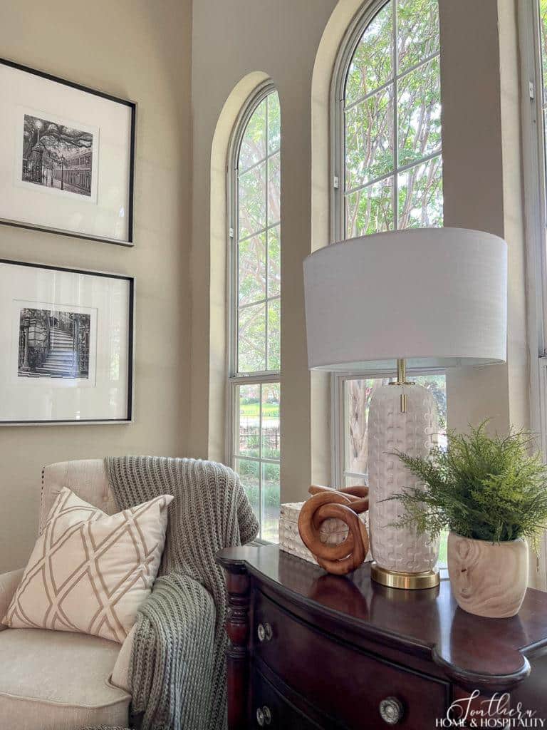
5. Add warmth with wood.
Wood furniture and accessories really bring contrast, depth, warmth, and richness to a cold, neutral room so make sure to include some brown wood. No one wants to feel like they’re living in “Sombertown.”
Mix in both light and dark wood tones. And if you are using lots of gray that’s been so popular, wood accents really help offset the coolness.
6. Add in color and bold pattern in “pops” to shake things up occasionally.
A neutral color palette also allows you to add touches of bright, saturated shades, trendy colors, or ones that speak to a particular season.
When you start with a neutral background, even the smallest touches of accent color and pattern will shine! To keep the room quiet, and still feeling neutral, go with a soft muted color.
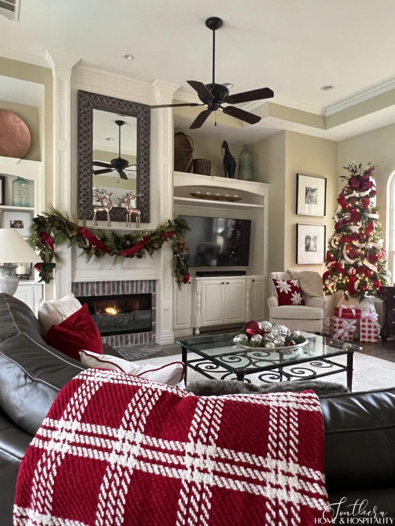
Or go bold like the red in my Christmas family room. My preference in color palette in the family room is actually neutral and serene for most of the year (aka not Christmastime). This holiday red definitely pops against my neutral furniture and walls.
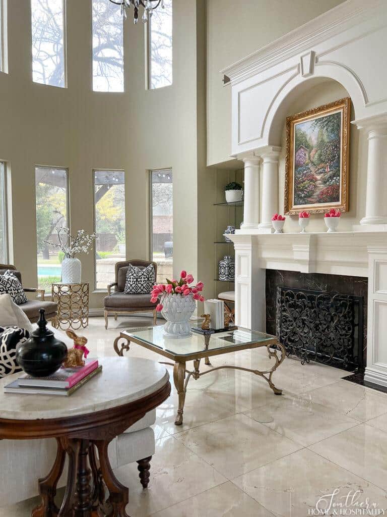
And in my neutral living room, these pops of hot pink were all I needed for spring decor:
Adding a splash of a bold pattern on throw pillows or a rug can totally transform the room’s style in an instant.
Think fun animal print for a younger, more edgy look. Or nautical stripes for a coastal grandmother vibe. Or French script to lean French country or farmhouse.
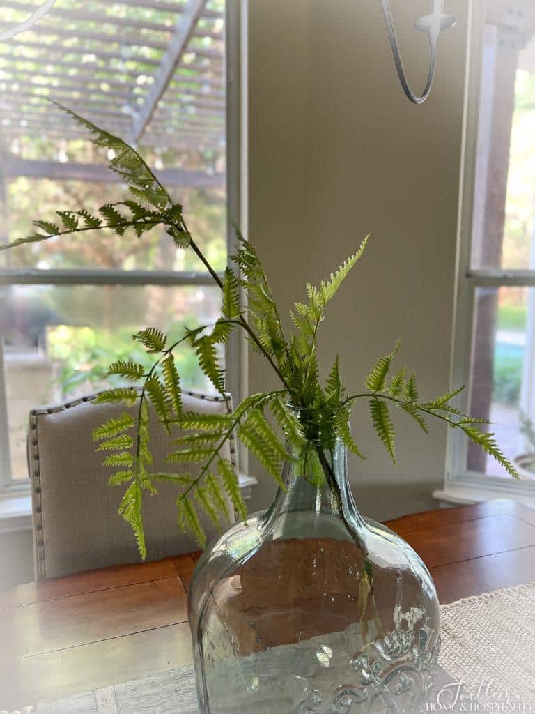
7. Always add plants.
Infuse life into the neutral palette with some plants. This color is a requirement for any room’s color palette, neutral included!
So, that’s how you create a gorgeous, designer-look room that will stand the test of time with neutrals.
Miss Boring and Basic is the queen of understated chic when it comes to decor.
And the second runner up will be tiresome and old before her time…

Before you go:
As always, I appreciate your visit, comments, and shares here on the blog! I’d love it if you also follow along with me on Pinterest, Instagram, and Facebook so you won’t miss any of my inspiration and ideas.
Don’t forget to sign up for updates to keep in touch.
If you’re not already a member of the SH&H family, I’d love to have you join me! You’ll not only get email updates, but you’ll have exclusive access to all the bonus materials in my free subscriber-only library, like this:
Pin it to remember it!
If you’ve enjoyed this post, please pin and share this on Pinterest:
Interesting thank you 😊
Great points! I used a lot of color on the walls of my last house that was very basic with very little architectural interest, and while it was colorful and fun, those colors on the walls definitely bossed the room and made it harder to chose rugs and other accents. When we built, I went very neutral in the large main rooms of the house (pale beige walls, warm white trim, doors, and kitchen cabinets, brown wood look tile floors) and added stained wood elements in the form of a decorative vent hood, beams, planked ceiling, French doors in study, etc. I am certainly enjoying being able to play with more accent colors with the neutral background. Not to mention, I won’t have to repaint for many years!
Hi Vicki! We had much more color on the walls a few years ago too. But it meant I had to match everything to it – now decorating is so much easier and it’s fun to be able to play around with different colors in the pillow and accessories!
Where did you find your black and white prints of the stairs going up to a building in your second picture. Ijust love it. Thank you!
Hi Nancy! I made them by replacing the artwork in those frames with what I wanted. I answered with more detail to your email, but let me know if you didn’t get it or have any more questions.
I love your choice of wall color. Pray tell what is it?
Thanks Nan! I wish I knew if it WAS an actual premixed color. Some of the rooms were painted with it when we moved in, and I took a piece of sheetrock that had been cut and placed back in the wall (don’t ask 🙄) and had it color matched at the paint store. If you want to email me I can snap a photo of the formula on top of the can for you. I plan on doing this at some point anyway, because I get this question a lot!
I think the brown sectional in the pictures is the same one I have. We moved into a new house last year and all I can think about is replacing it but It looks so good in your room. I have gone over your pictures trying to see why yours looks so good and mine so bad!
AND….The pillows are a constant battle trying to keep them from sliding down!
All of this to tell you that I’m seeing my brown couch in a different light and I might be able to keep it awhile longer or at least tolerate it!
Hi Lee! You know I actually picked out that color based on the slate floor I had to work with and all of its brown and gray tones. It’s not a true brown but a very grayish brown…actually Bernhardt calls the color gray but I’ve always seen it as more on the brown side. I love the leather just because it doesn’t get dirty. I don’t really have a problem with the throw pillows sliding I guess because my family sits on them or lays on them. If you hate the brown-ness of the sofa, have you ever tried some pillows with gray and off white on it?