4 Ways to Make an Ugly, Outdated Room Pretty: Our Astounding Living+Dining+Entry Makeover
Inside: How fixing these 4 things made a dramatic difference in this ugly eyesore of a room! ➡
My jaw was on the floor.
This lovely, charming, stately southern lady of a home, surrounded by a park-like front yard, was hiding a dark, dirty secret.
As I walked through the door for the first time, I was NOT expecting this:
If you’re new to the blog, let me bring you up to speed – we fell in love with this unwanted ugly duckling. We made her ours and set about renovating this house into the swan she was meant to be.
Many others who toured the listing laughed and dismissed her. But we saw a special lady waiting to be discovered. For someone to love her again.
See more about our home story here.
I was mortified to have anyone over until we had at least fixed the most used and most visible rooms, which unfortunately were also the most horrendous.
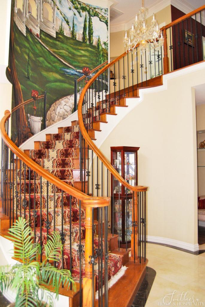
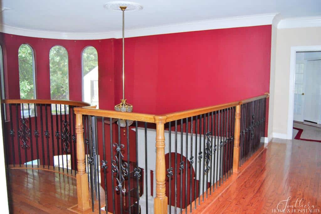
The living room, dining room, and staircase were completely circa 1998. And the stair carpet and light fixtures last cleaning may have been in that same year.
But we saw beyond the red paint, Italian countryside wall murals, and the 16 years worth of dirt in the oriental rug stair runner.
Like in every teen movie when you supposedly can’t tell the girl is beautiful until they remove the ponytail and glasses, we had to give this grand area a makeover to uncover its potential. And since these were the formal rooms of the house, this makeover would have to take her all the way to the prom.
This post contains Amazon and other affiliate links for your convenience. As an Amazon Associate I earn from qualifying purchases. If you purchase something through any link, I may receive a small commission, at no extra charge to you. I only recommend products that I love or would purchase for myself. See my full disclosure here.
The ponytail and glasses and what was underneath.
All of this weirdness, ugliness, dirtiness, and disrepair was overwhelming, to say the least. Where to start? This area was the entire home’s first impression.
But we were able to achieve what seemed an impossible undertaking by changing only these four design elements:
- the paint color and sheen
- the outdated features
- the fixture styles
- the overall color palette
Boiling it down to these four things allowed us to wrap our heads around what needed to be done. This plan made this monstrous project feel more manageable.
Come inside and hold on tight. You’ll get a nice fix to satisfy your inner “lookie lou”. What is it about looking at the weird things people have done to their houses on the internet that’s so satisfying? It’s like rubbernecking as you drive by a fender bender. (Disclaimer: none of the furniture in the before photos is mine.)
1. Paint: The makeup of a room makeover.
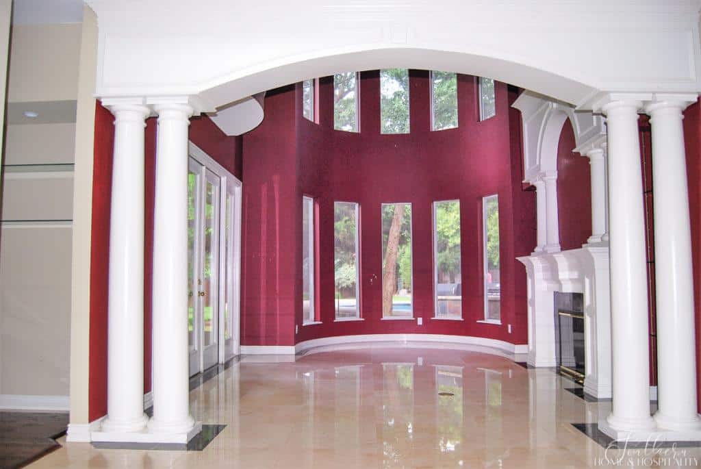
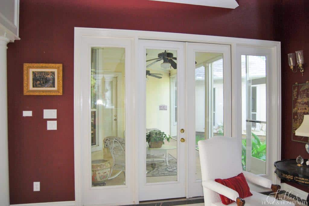
The 90’s burgundy red paint was A LOT in a two-story room. Not that we were keeping it anyway, but the sloppy paint job made it so much worse. Even the white paint on the moldings and trim looked dated. The glossy finish was also yellowing in places.
The wine red was dramatic for sure. But not in a good way.
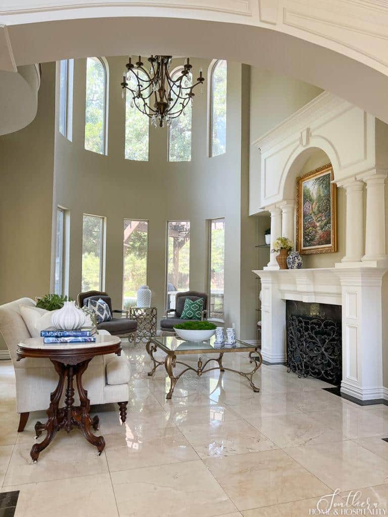
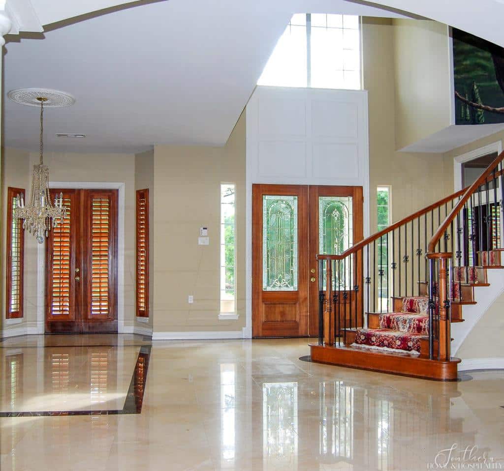
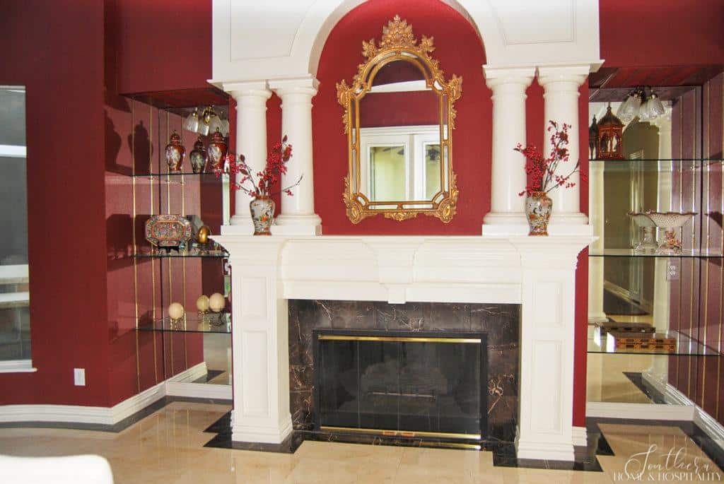
Covering all of the burgundy with a fresh coat of neutral light tan paint and putting lovely, classic warm white in a satin finish on all of the trim made a huge difference.
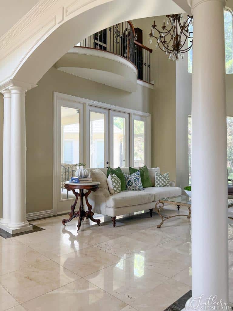
Getting rid of the red and the softer sheen on the trim paint immediately transformed the whole living room!
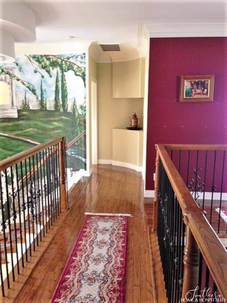
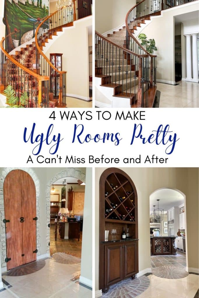
And the red wasn’t even the boldest statement in this area. What hit you in the face when you opened the door was that floor to ceiling painted mural of the Italian countryside going all the way up the stairs.
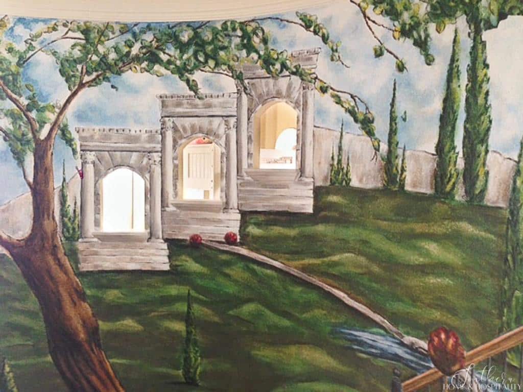
Oh, and it gets better. The gothic windows had a special 3D effect – a view. You could peep into the bedroom from the front door.
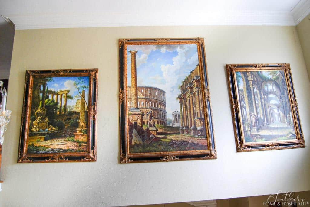
The mural paired well with a nice Chianti – and these huge art pieces that hung directly opposite:
It was so very gratifying to watch as the paint roller erased this eyesore. I hope the artist never sees this post. Can you imagine balancing on these stairs to paint this??
We filled in the “windows” to the bedroom and now the curved staircase wall is normal again. We chose to leave it empty because the area has so many nice curves and architectural features for the eye to take in already.
I wiped a slightly darker and less “red” stain in a satin finish over the glossy wood to neutralize the orange tone a bit and give the wood a softer, hand rubbed look.
2. Removing the dated and “what were they thinking” features.
The next area we addressed was getting out the outdated. And the just plain weird.
This area between the dining room and kitchen fit right in – at Medieval Times. The faux cobblestone wasn’t just paint, the stones had built up texture.
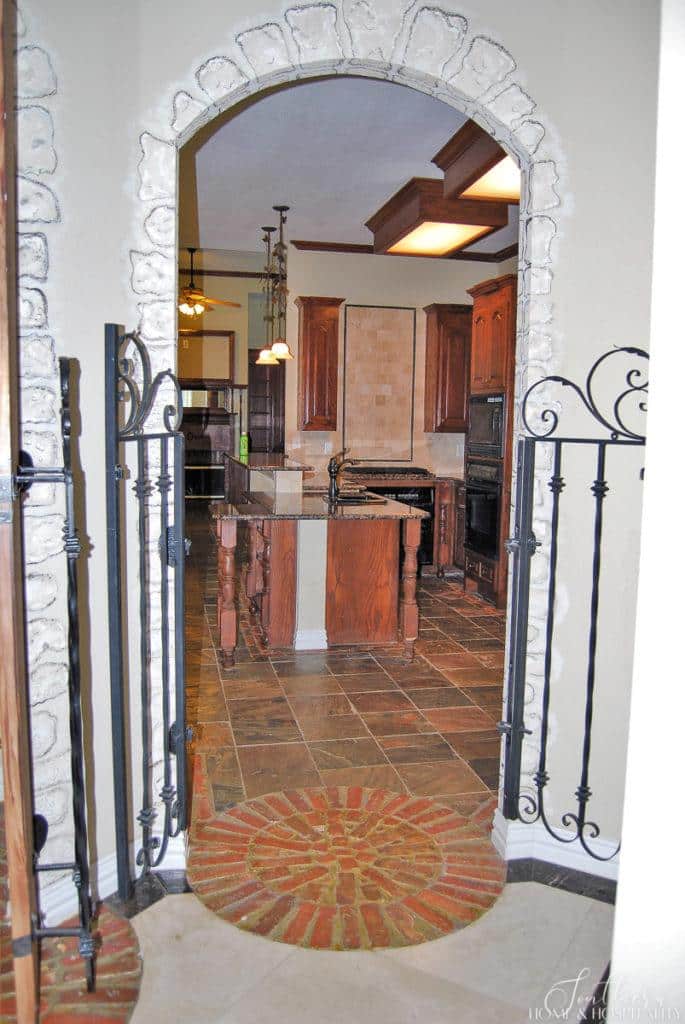
They were all in on the theme and added this “feature” – real iron gates.
The iron gates didn’t go to the trash, you can see where they are now in this post, “Ten Ways to Decorate for Free Using What You Already Have.”
And the arched doors with faux painted woodgrain and hinges opened into a tiny room.
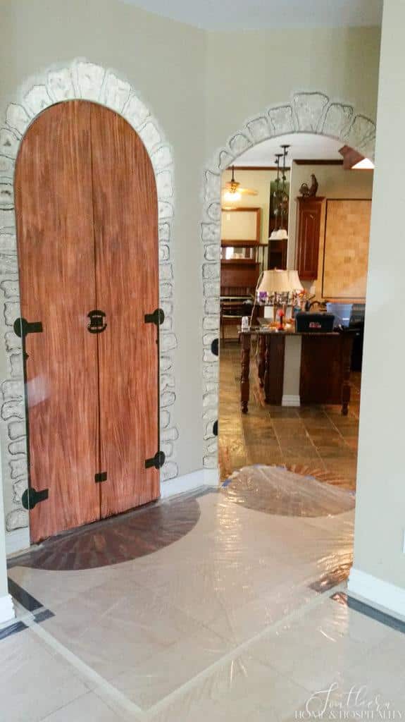
Not sure of the intention when it was built. For the wenches or for wine?
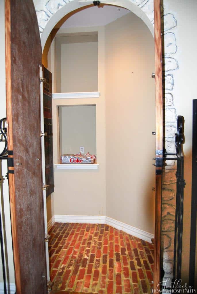
It became a game changer in our kitchen though. We opened it to that room and had shelves built in. Now we had a pantry!
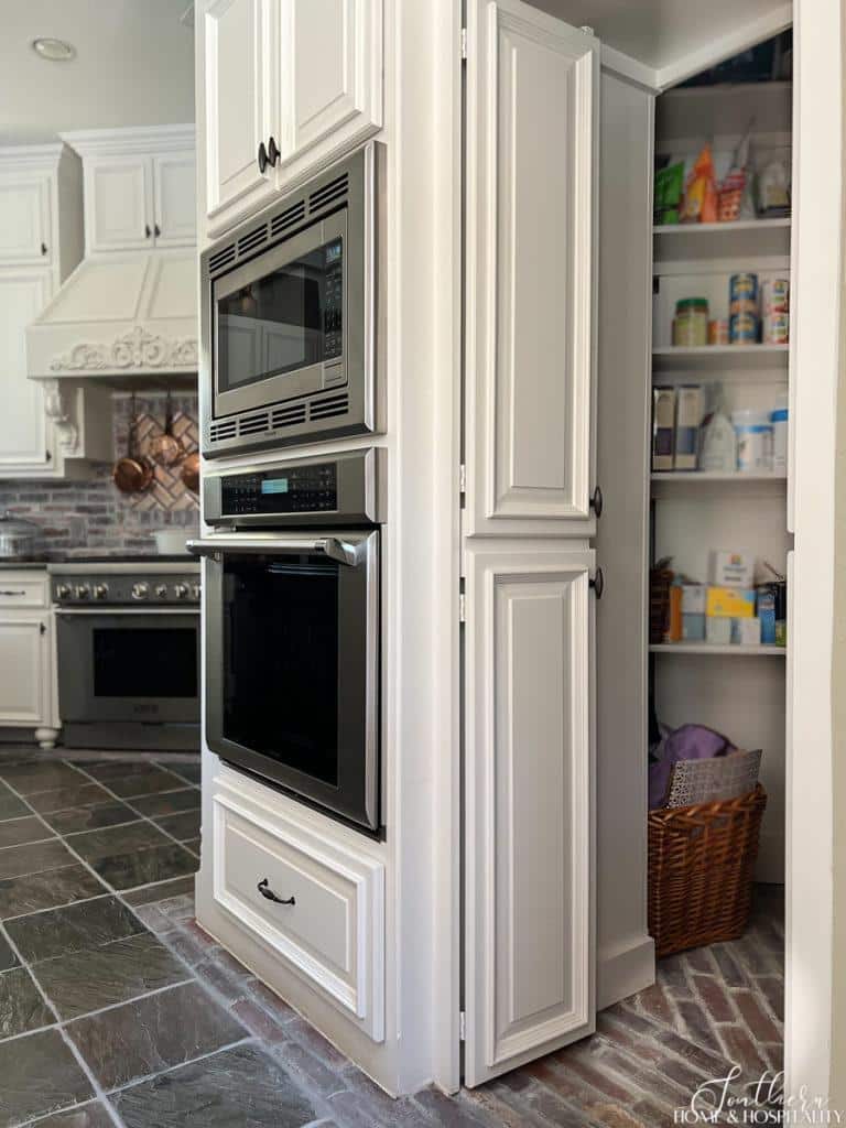
You can see the whole kitchen makeover here. The kitchen “before” was just as bizarre!
And I’m giving my husband props on his brilliant idea of what to do about the dining room entrance to this space. Simply closing the wall up would leave a brick arch inlay on the floor that made no sense.
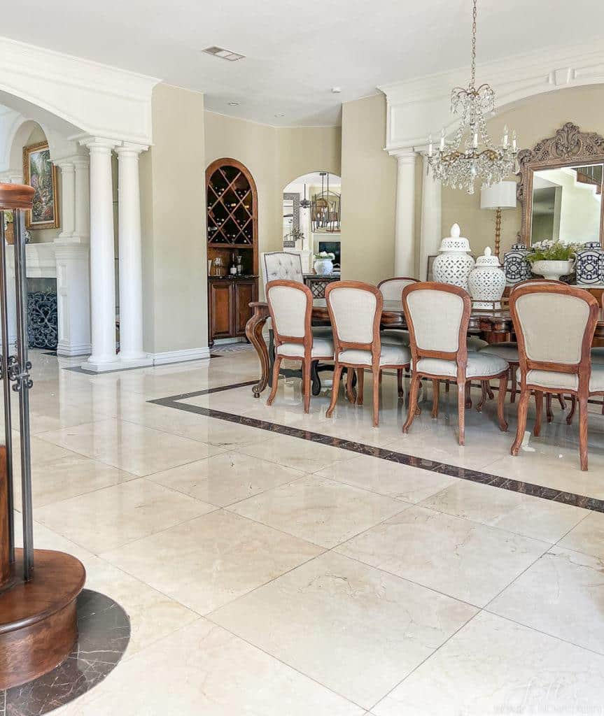
His great solution was a wine bar cabinet built in its place. And it looks totally intentional.
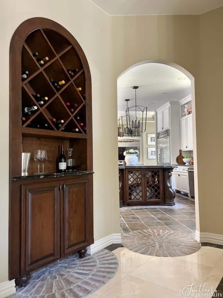
And the wine is right there for dinners in the dining room!

3. Choosing simple, classic styles and patterns.
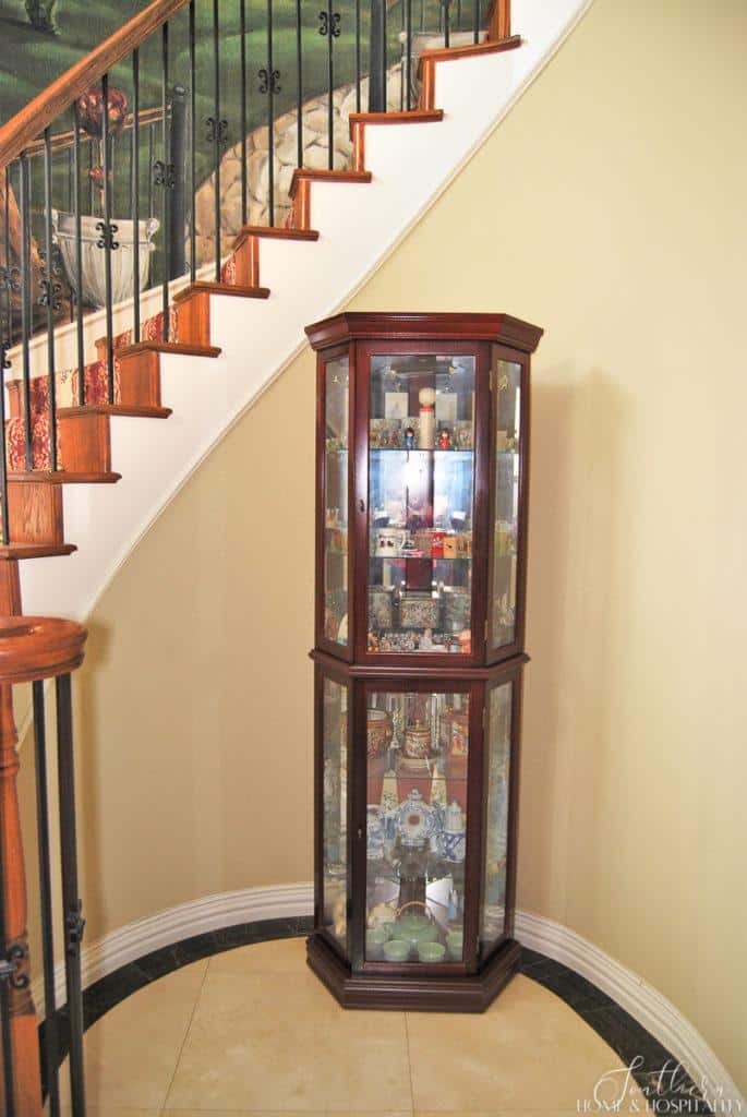
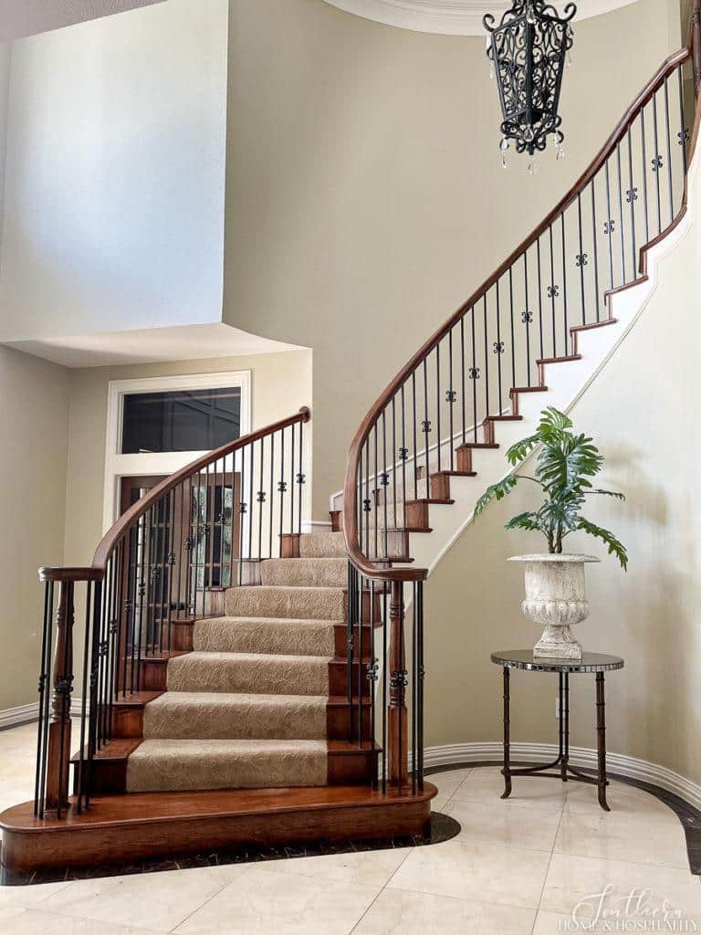
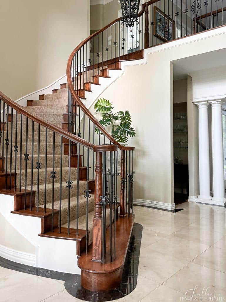
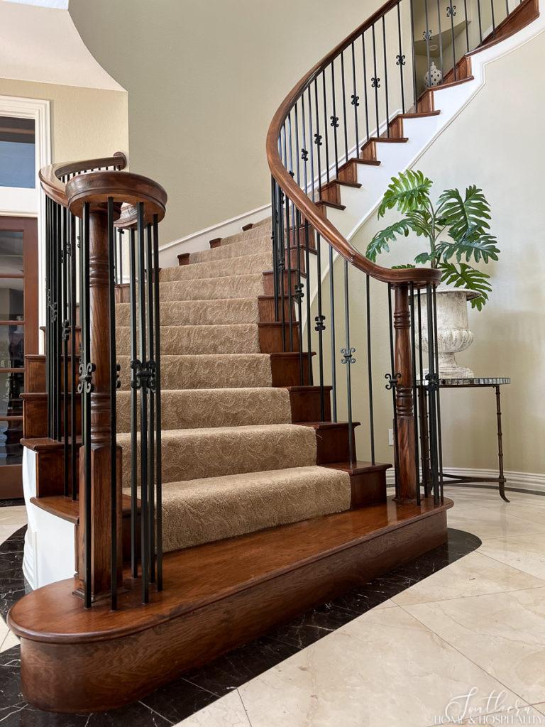
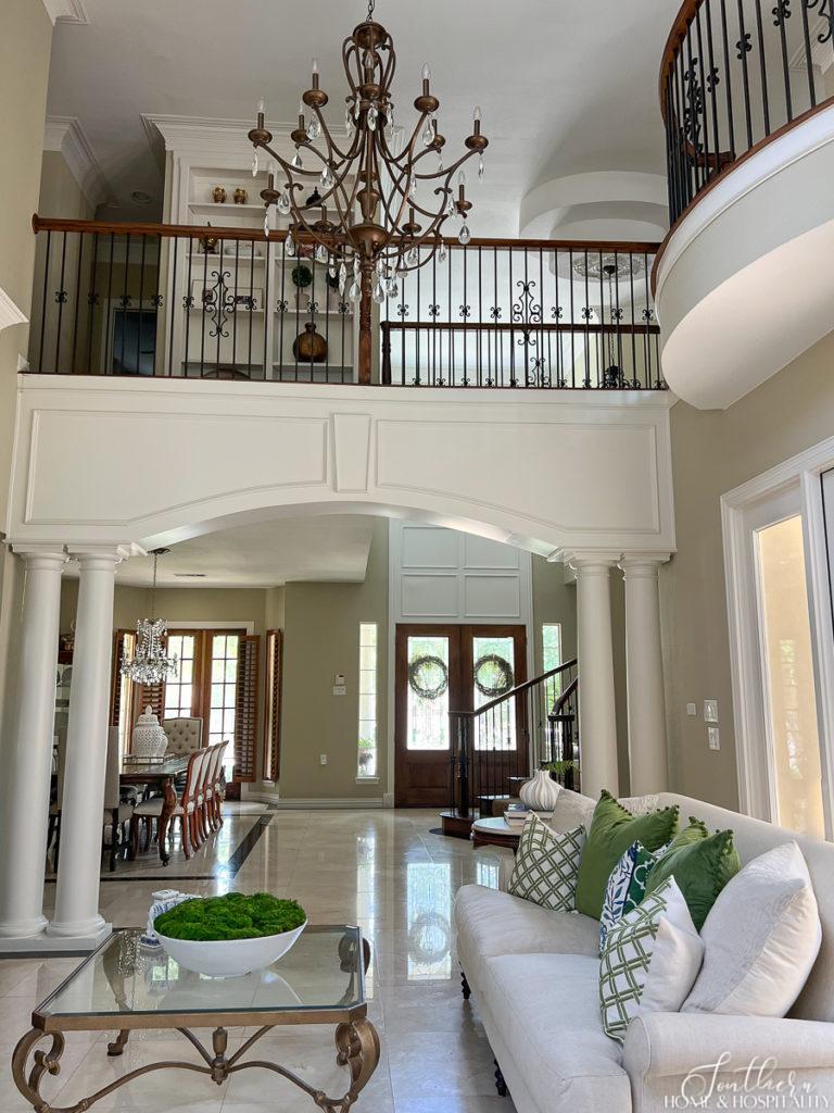
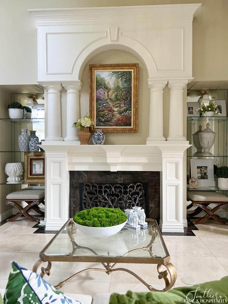
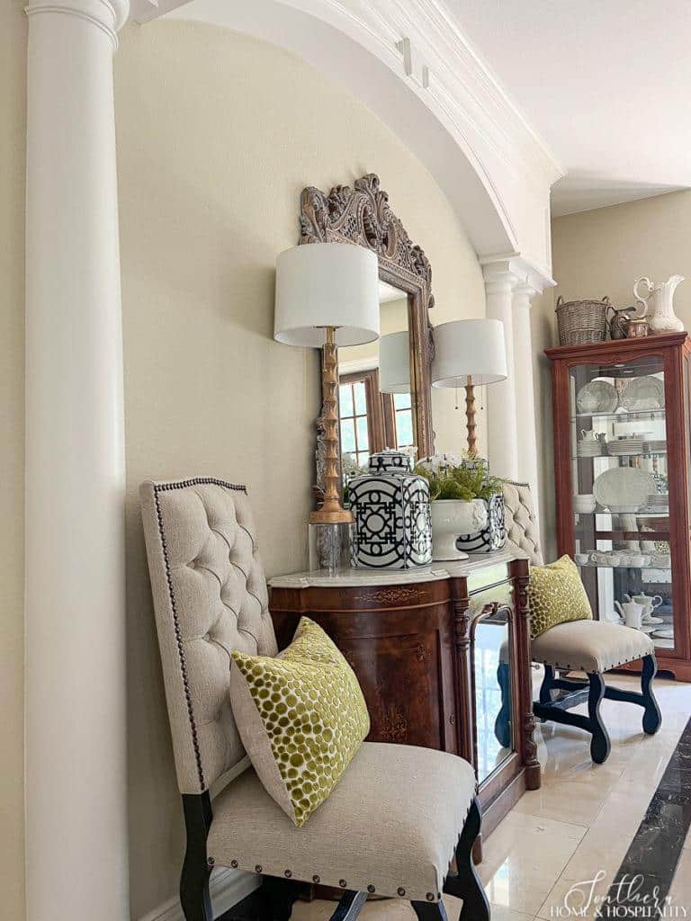
The bones of the room were already classic in many ways with the marble floors and fireplace surround, plantation shutters, and iron stair balusters.
And all of those classic molding and architectural features special to the house are what I wanted to shine. To satisfy this category we just needed to address the stair carpet and lighting to make them more simple and classic.
The 90’s called and they want their carpet back.
I must confess my younger 90’s self coveted homes that had oriental carpet runners and brass stair rods, but it’s not my taste now. This carpet was so worn and dirty and the burgundy rose pattern looked like it should be in Mamaw’s house. (I did keep the rods. I wouldn’t mind if they came back in vogue.)
We replaced it with a neutral color stair carpet in a timeless damask scroll sculptured pattern:
This southern belle was ready to shine with some new bling.
We changed out all of the light fixtures. They were either too formal and frilly, or just looked dated. Here’s a look at the old fixtures:
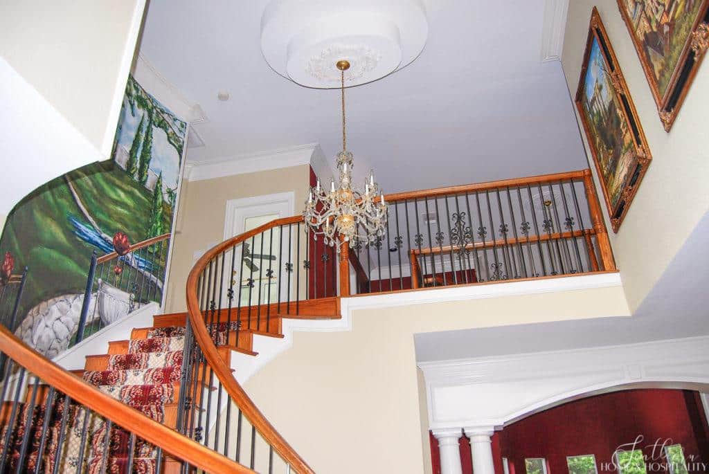
A couple, like the entry chandelier and “crystal” ceiling fan, were nice fixtures in their day.
But these sconces in the built-ins were nineties builder grade cheap-as-they-come.
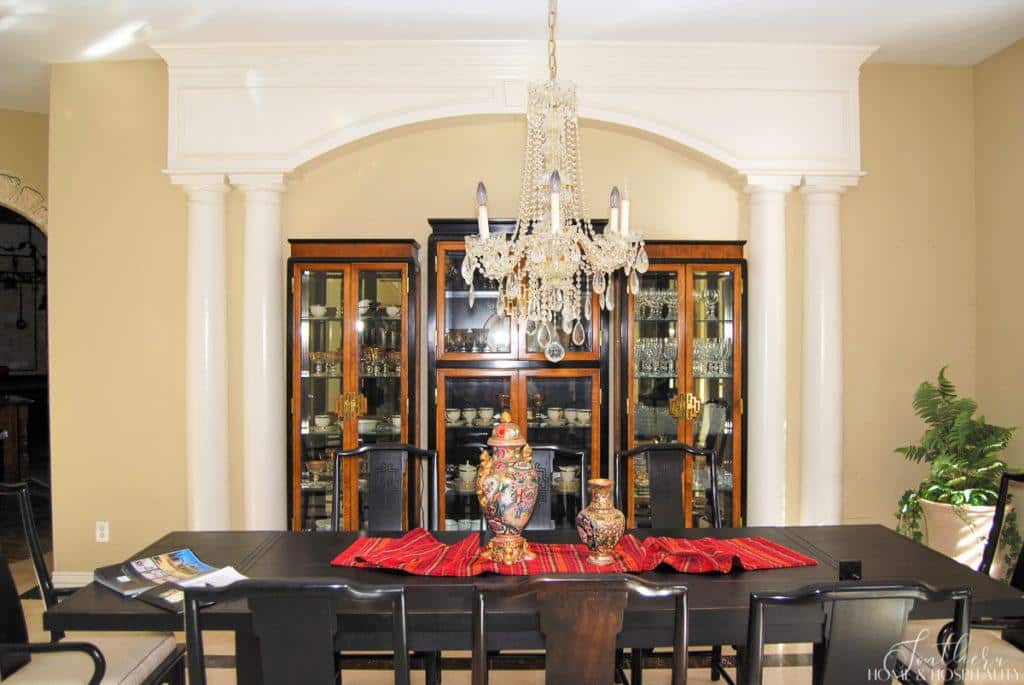
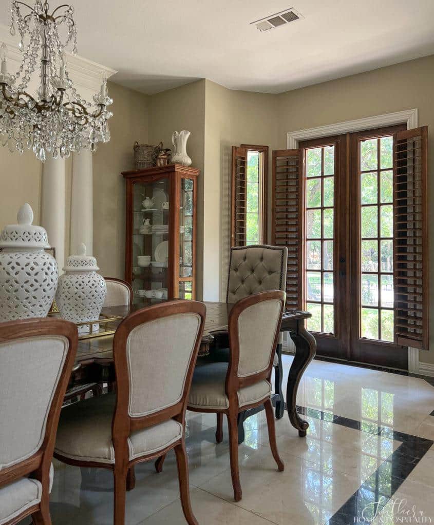
And this dining room light fixture never stood a chance because my beloved heirloom French chandelier was coming with me.
Here’s the home showing off her new formal jewelry:
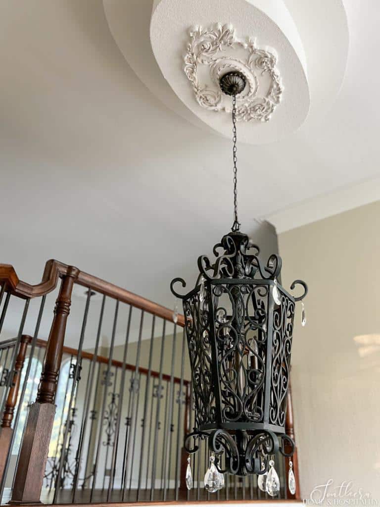
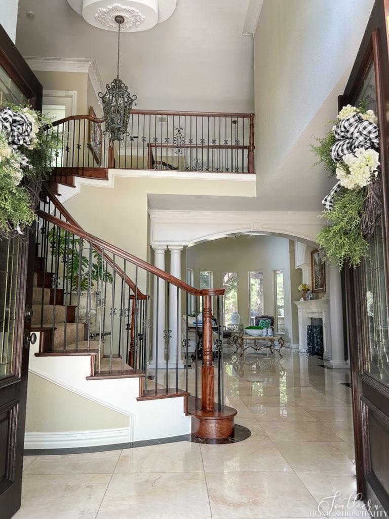
For the foyer fixture, I chose a black iron cage pendant to blend with the iron stair railing. And because it looks like something you might see in my favorite southern cities like New Orleans and Charleston.
I’m usually against taking a ceiling fan out in Texas but this formal living room needed a chandelier. This style is not too ornate but still drips with some classic crystals.
And those crystals tie into the dear-to-my-heart vintage crystal chandelier in the dining room…
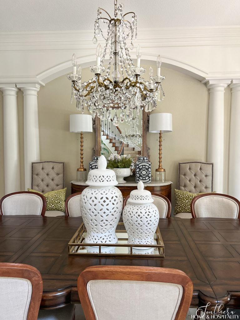
It’s a family heirloom and a French antique – my parents bought it in New Orleans back in the 1950s for the home I grew up in.
The sconces in the built-ins were replaced too. These simple little lights were the hardest to find. Nothing would fit that close to the ceiling!
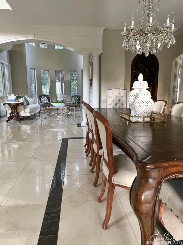
4. Choosing neutral and light colors for walls and flooring.
And the last way we fixed this outdated space was to bring in a brighter, cleaner feel by using only neutral, light colors.
The beautiful marble floor already fit the bill thank goodness. That would have been a major expense and mess to replace.
The paint color scheme calmed everything down. We carried this light neutral shade of tan throughout most of the house to create an easy flow. We repainted all of the trim, molding, and doors with one of my favorite warm whites, Swiss Coffee.
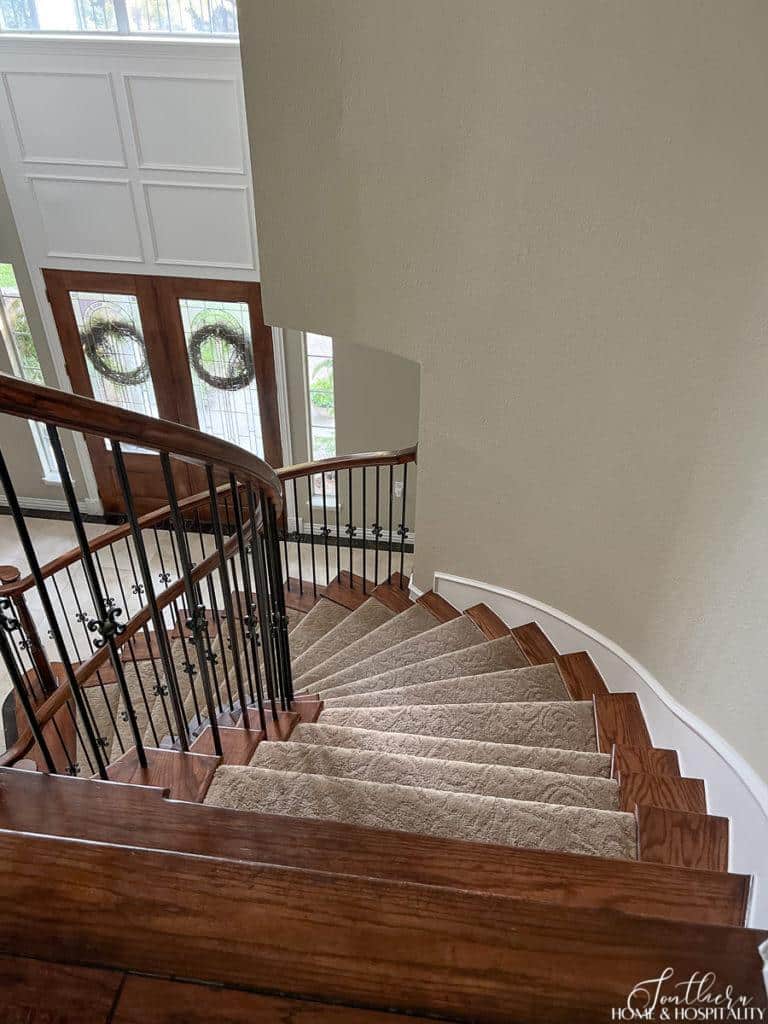
The only other color choice that remained was the stair carpet. While this medium brown is not super exciting, I chose it based on whether or not it would show the inevitable gray traffic track. I call it “dirt brown” for that very reason – it hides the dirt. And after several years, so far so good!
See why you should consider decorating with neutral colors in the post, “7 Secrets for Decorating with Neutrals for Rooms That Are Anything But Boring“.
Fixing just these 4 elements lets the architecture shine.
Now that the attention hogs (the ugly paint, weird features, and outdated and worn fixtures) were gone, it allowed all of the shapely architecture of the home to take the spotlight.
The arches and columns. The graceful curves.
The classic black and cream inlaid marble floor.
The many windows. And the French doors.
Without these calm, clean, neutral, and classic choices, the features were sadly going unnoticed. They even added to the “there’s too much going on here” chaos before.
Other ways to make a room more attractive.
If you have a room you dislike, but aren’t actually renovating like we did, here a few other golden nuggets that you can use to make your room more attractive:
- Make sure everything is clean. A clean room just feels more pleasant to be in even with zero other changes.
- Get rid of anything worn or disguise it. Fluff up those droopy sofa cushions and throw pillows. Cover that undesirable couch fabric with the stain using a slipcover or throw blanket.
- Get rid of clutter. Not just mail and water bottles. Too many accessories count as clutter. Neaten up or hide TV cords. Invest in attractive storage baskets to hide things you use all of the time.
- Make sure you have some empty space on the floor, on furniture surfaces, and some bare walls.
- Make sure you have adequate lighting. Dreary rooms are not attractive. Open the blinds or drapes wide or remove them altogether.
- Give outdated accessories new life with paint.
These formal rooms in our home are used mostly just for special occasions. It’s where we gather around the tree on Christmas morning. And where we eat Thanksgiving dinner. But we walk through them all day long.
And they’re the home’s first impression.
Do you think we did right by this southern grand dame’s formal look? I think she’s a lot happier. I know we are.

Before you go:
As always, I appreciate your visit, comments, and shares here on the blog! I’d love it if you also follow along with me on Pinterest, Instagram, and Facebook so you won’t miss any of my inspiration and ideas.
Don’t forget to sign up for updates to keep in touch.
If you’re not already a member of the SH&H family, I’d love to have you join me! You’ll not only get email updates, but you’ll have exclusive access to all the bonus materials in my free subscriber-only library, like this:
Pin it to remember it!
If you’ve enjoyed this post, please pin and share this on Pinterest:
I think everything you did to your beautiful house improved the looks immensely. Would you mind sharing what color tan that you used for the walls? Also, please write a blog teaching how to select throw pillows.
Thanks so much Mary! The tan walls were already in place when we bought the house and I’ve been color matching them. If you’d like to test it, I have the custom code you can take to the paint store on the blog if you look under Favorites and Finds and then Shop My Home. And the throw pillows is an excellent idea for a post. We are all always buying them!
Absolutely beautiful transition! I would love to see more about your kitchen. What countertop you recommend. I have corian and it is still good but is it too old fashioned?
Help
Oops I was so taken aback by the transformation of your home I forgot to mention
Absolutely beautiful you are very talented
Awww thank you so much for those kind words Charlotte!!😊
Thank you so very much for sharing your experience and your wonderful taste
I wish I could do this but unfortunately my home is a mishmash of old and new, however all of this doesn’t work at all.
Beautiful job Kate…..Outstanding transformation! I like light and bright rooms!
Thank you Marlis!!
What a beautiful transformation. Most people wouldn’t have seen the beauty behind the not so pretty. Just gorgeous, my friend.
Thank so much Renae!!
Everything you did is brilliant and beautiful!
Awww thanks Diane!!😊
I’ve always thought your home was beautiful from the pictures, but the transformation is amazing! I bet you are right, she’s a lot happier now!
That’s so sweet to say Susan!!
You sure worked your magic on this home. I remember the first time I walked into the foyer and thought to myself, how on earth are you going to transform this place. You had a vision and what a great job! Well done
Thanks Irene! I remember you were so sweet to show us through even though you were sure we weren’t going to be interested!!
I’m a newbie to your blog & I really enjoy it! Your home is beautiful. What an amazing difference a little paint (well, a lot of paint) & a good eye for decorating made!
I’m glad you found me Becky and hope you’ll keep visiting. And yes it was a WHOLE LOT of paint!
I love, love, love your home. You did wonders to bring it to life! How I wish I had found your blog before we built. Perhaps I can still use some of your ideas. Thank you for sharing.
Thanks so much Jessie! If you’re like me, you never stop decorating.😆
What an amazing transformation. I never saw the before pictures.
Thanks Di! It was something right?
Your home is beautiful. I love checking your blog every day.
Awww thank you Betsy! I’m glad you come to it often!!