50 Best Paint Colors Designers Swear by for Master Bedrooms
Inside: The best bedroom paint colors trusted by interior designers to transform your sleep space into a tranquil oasis of serenity and relaxation! ➡
We all have those stressful days.
One of those where the only reason you know you have your shirt on inside out is because you spilled coffee on it.
And all you can picture is holing up in your bedroom at the end with some wine and a masseuse (and maybe Ryan Reynolds).
But stress-reducing fantasies aside, there’s a more realistic way to create a tranquil haven away from the outside world.
It’s as simple as covering your bedroom walls in a calming paint color.
So if you’re looking to transform your bedroom into a sleep sanctuary, I’ve put together this list of some of the most tried and true paint colors that interior designers turn to again and again to create a serene space!
The best paint colors for a primary bedroom.
Paint is one of the best ways to make a space feel any way you want.
But bright colors raise the heart rate. And won’t promote a good night’s sleep—which is the main goal for a bedroom oasis.
So this list of the best colors for a relaxing bedroom focuses only on soft, subtle, and muted hues.
You’ll find dreamy blues that evoke tranquility, whispers of green that connect you to nature, comforting neutrals that embrace you like a soft hug, and a few moody, darker shades that cocoon you for a blissful night’s sleep.
So get ready for lots of gorgeous, soothing color inspiration!
(If you don’t want to see the whole list at once, jump to the color section you’re most interested in from the table of contents below.)
Note: Most of these shades are from Sherwin-Williams (SW) and Benjamin Moore (BM), which I’ve personally seen the most and have the most experience using. While many pro decorators recommend colors by Farrow and Ball (with their client’s money). I usually steer clear of falling in love with them because of the price, so I only included a couple of these designer recommendations.
Best white paint colors for bedrooms.
White walls have been at the height of their popularity for a few years now. It’s a great way to make a small bedroom feel larger, and it’s easy to change your color scheme with a just few pops of color.
So let’s kick off the list with eleven different designer favorite white paint colors.
SH&H Tip: White doesn’t have to feel cold and flat. Make sure to add in wood tones for warmth and contrast.
Alabaster by Sherwin-Williams.
A bright, neutral, warm white with balanced undertones. This one is the front runner favorite in whites right now.
White Dove by Benjamin Moore.
A neutral, clean, classic white that’s also quite popular for cabinets and trim.
Aesthetic White by Sherwin-Williams.
A light white with cool undertones.
Simply White by Benjamin Moore.
A clean, crisp white just like the name says.
Snowbound by Sherwin-Williams.
A cool white with a slight gray undertone.
Cloud White by Benjamin Moore.
Another warm, pure white that’s also widely used for trim and cabinets.
Shoji White by Sherwin-Williams.
A warm, creamy white that borders on greige.
Origami White by Sherwin-Williams.
A clean white with cool undertones.
Chantilly Lace by Benjamin Moore.
A slightly warm white that reads as pure white.
White Heron by Benjamin Moore.
A classic bright white with slightly cool undertones.
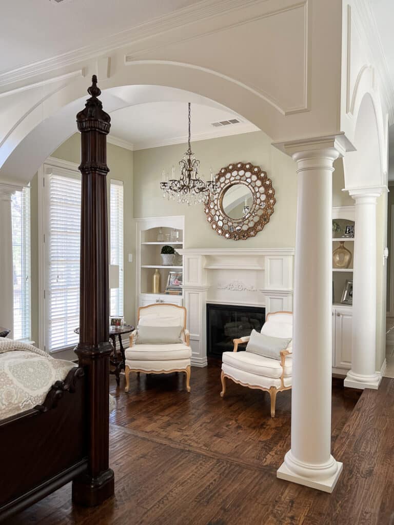
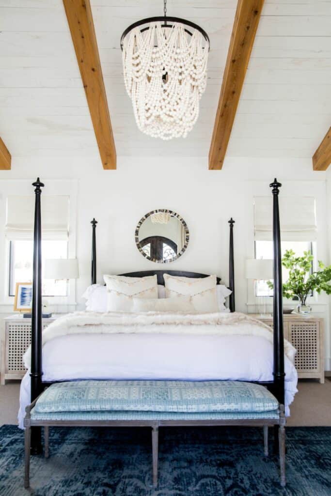
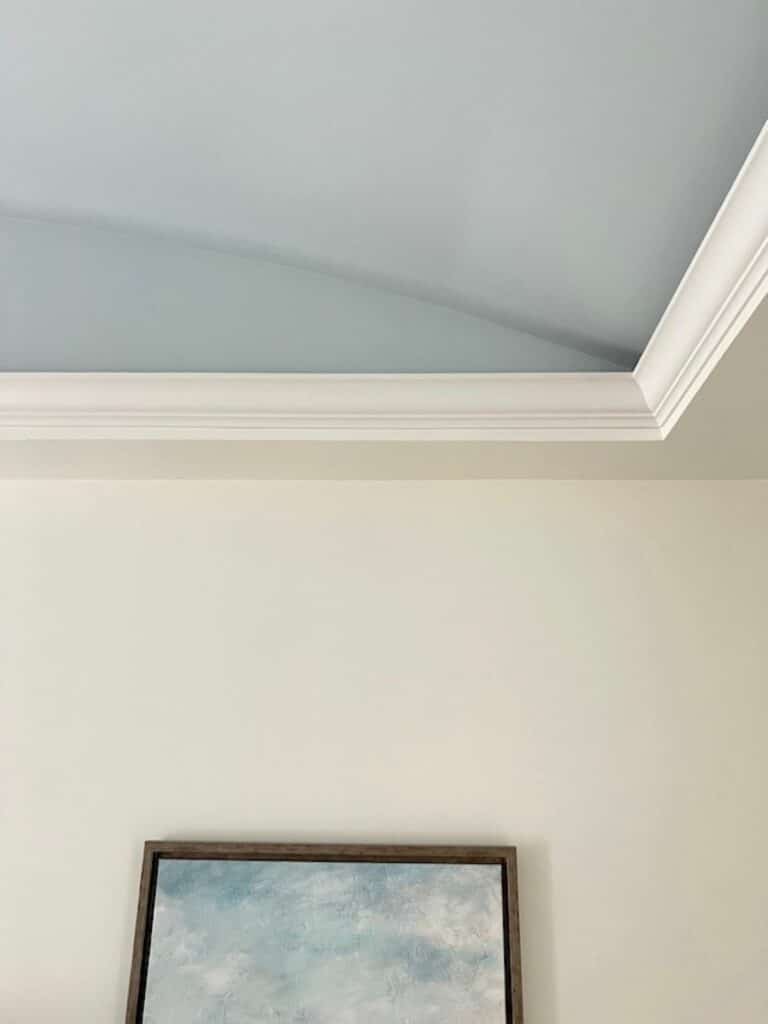
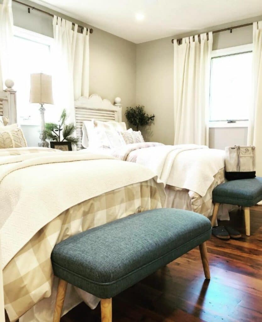
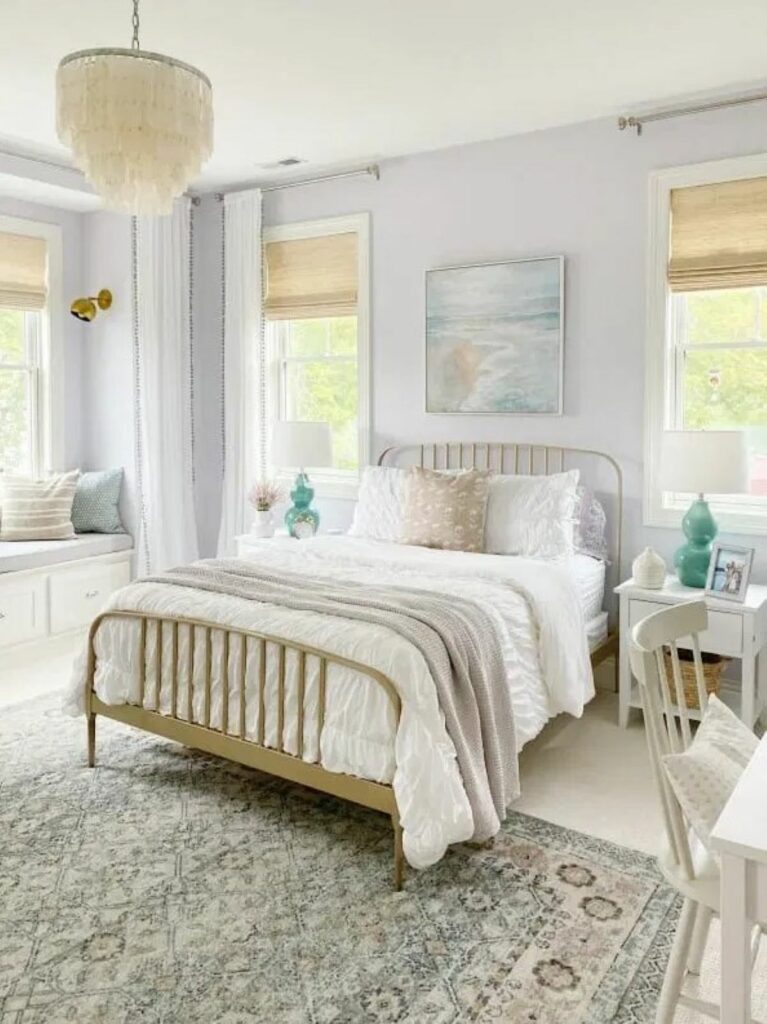
Swiss Coffee by Benjamin Moore or Behr.
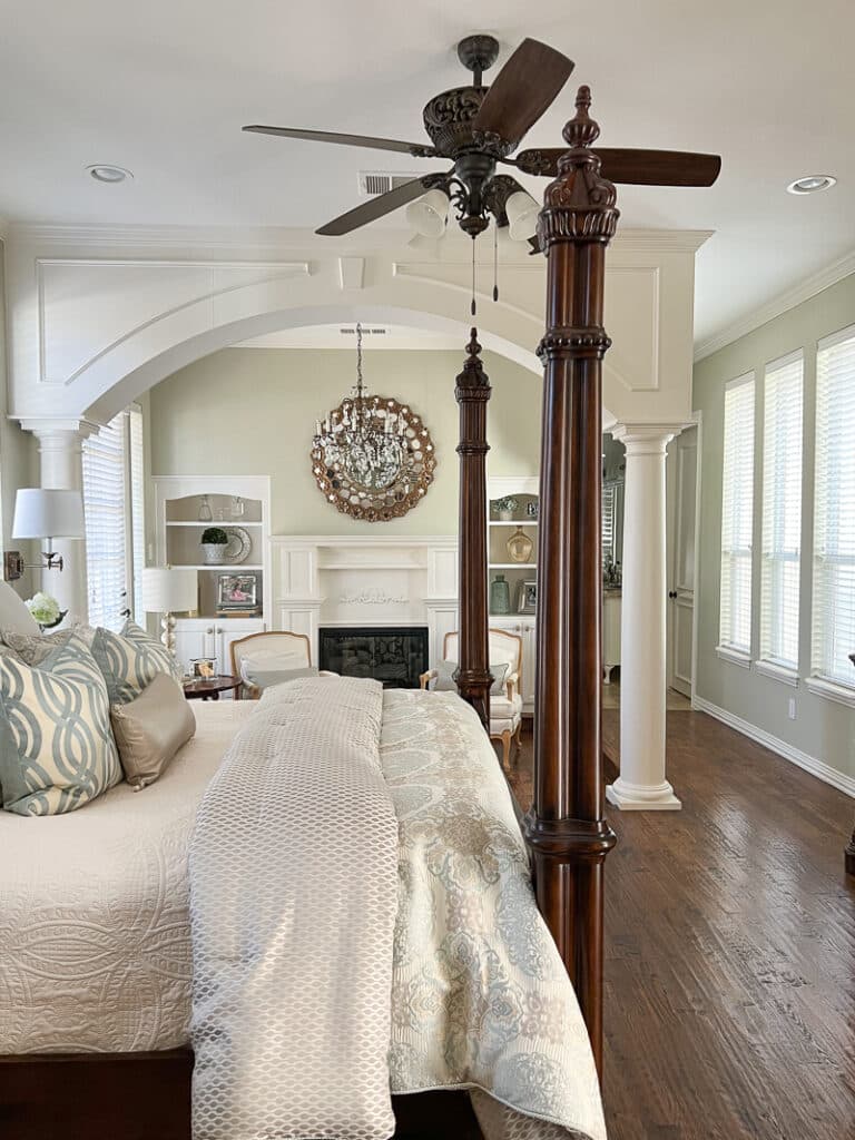
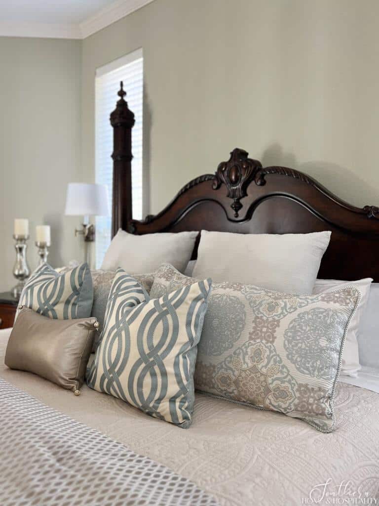
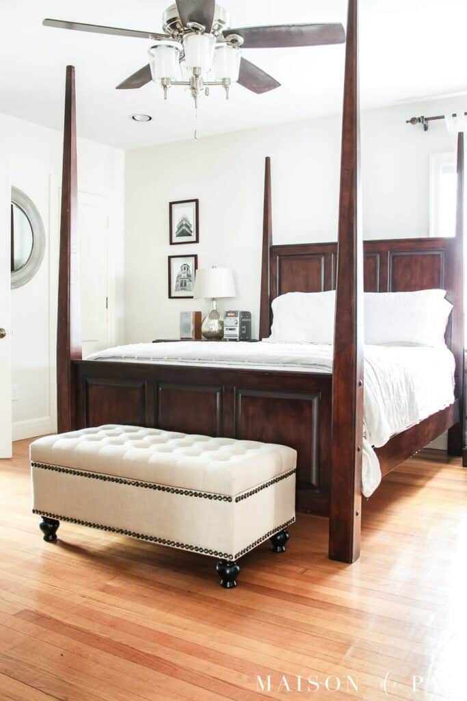
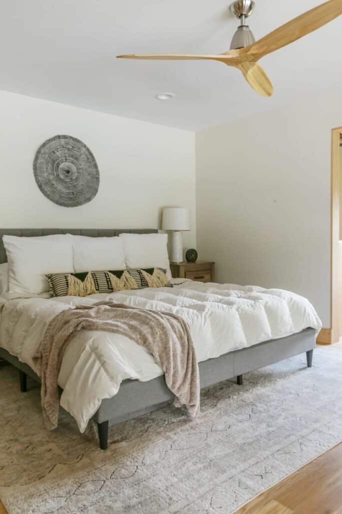
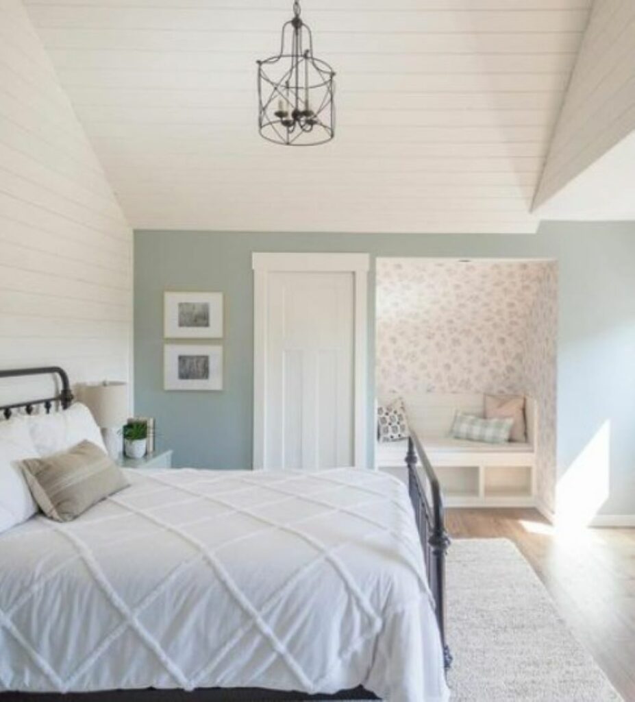
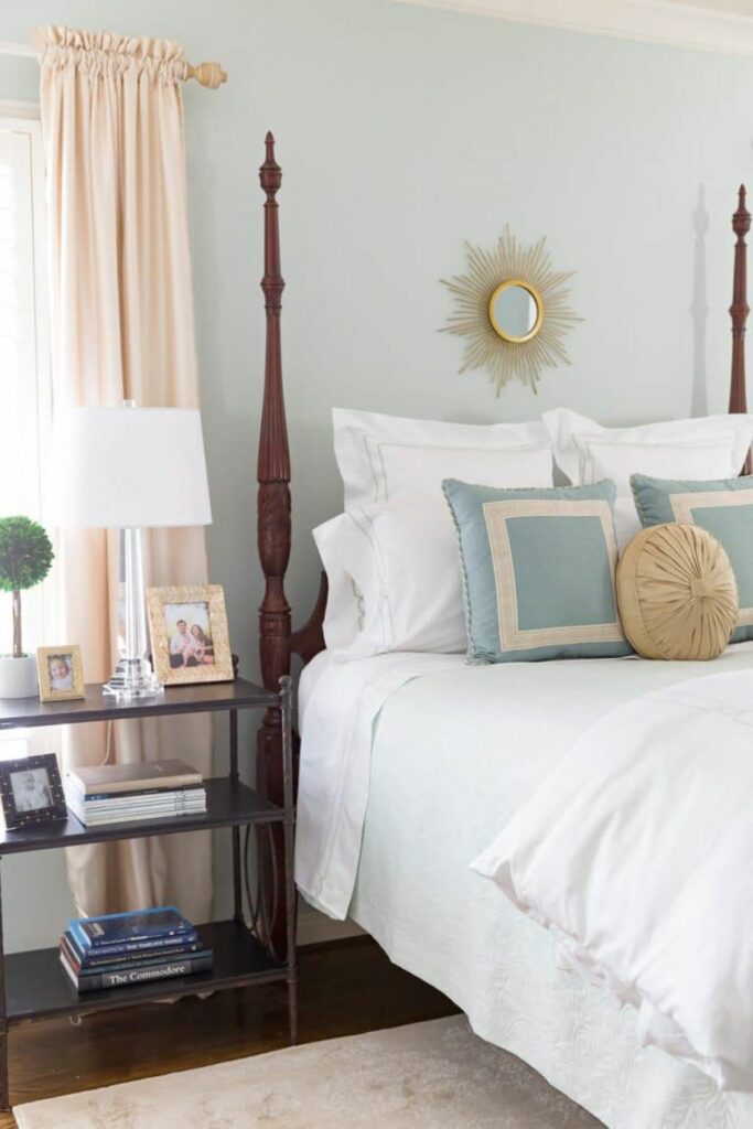
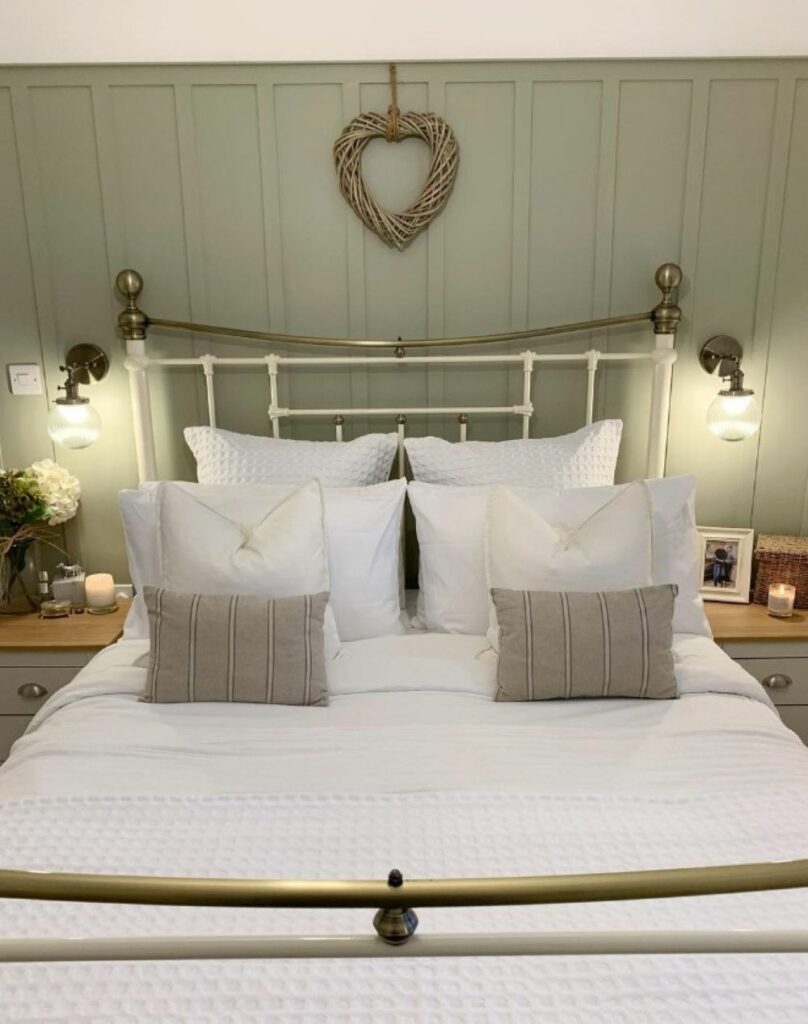
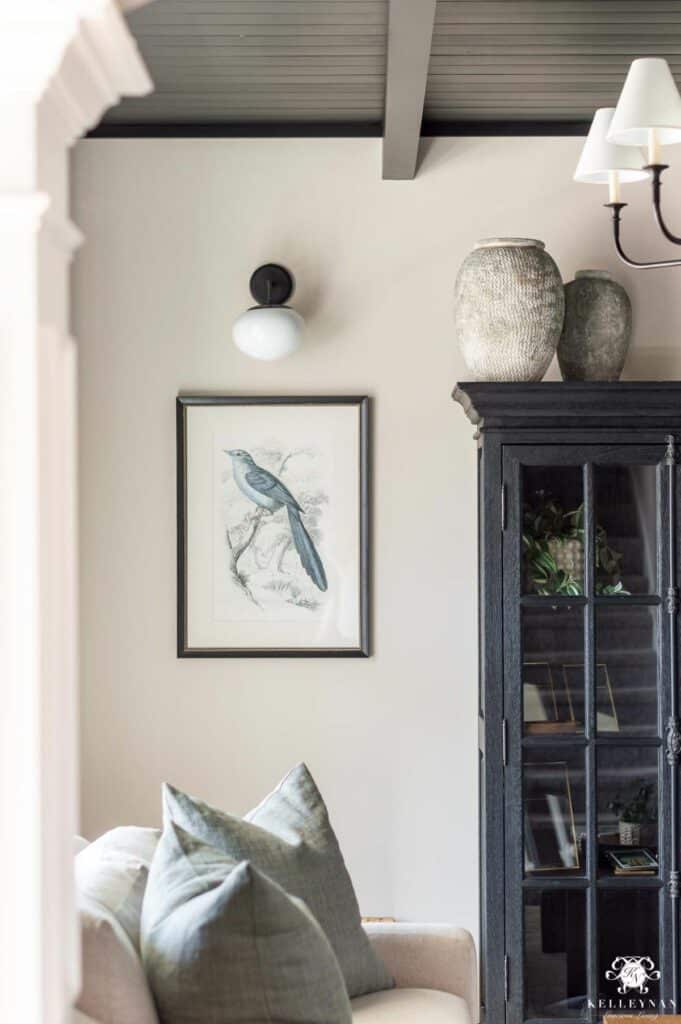
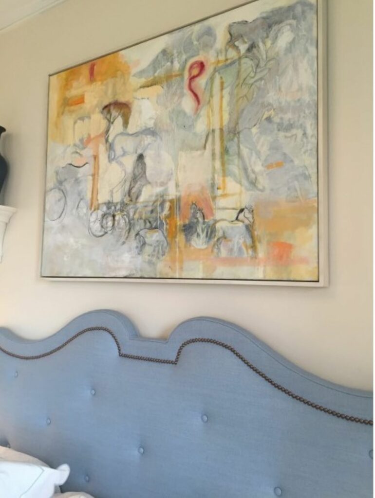
This is one of my personal favorite colors, and we’ve used both the BM and Behr versions on the cabinets and trim in our home, including our primary bedroom:
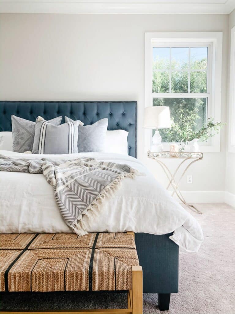
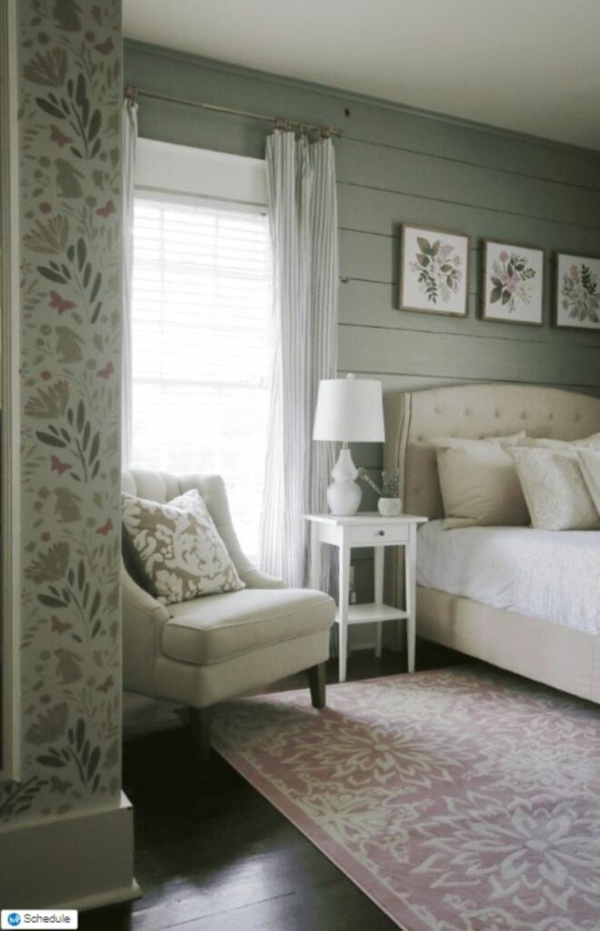
And here’s a master bedroom example with Swiss Coffee on the walls:
Restful paint colors for bedrooms.
Let’s next move into some color. And first up are the two colors most associated with spas, sanctuary, and calm—blue and green.
Best blues for bedrooms.
Tradewind by Sherwin-Williams.
A breezy light blue with green and gray undertones.
Rainwashed by Sherwin-Williams.
My daughter’s playroom was painted this color and I can attest, it’s a beautiful blue. It’s described as a bluish-green, but in our home, it definitely read soft blue.
Lullaby by Sherwin-Williams.
A true soft, subtle blue with gray undertones.
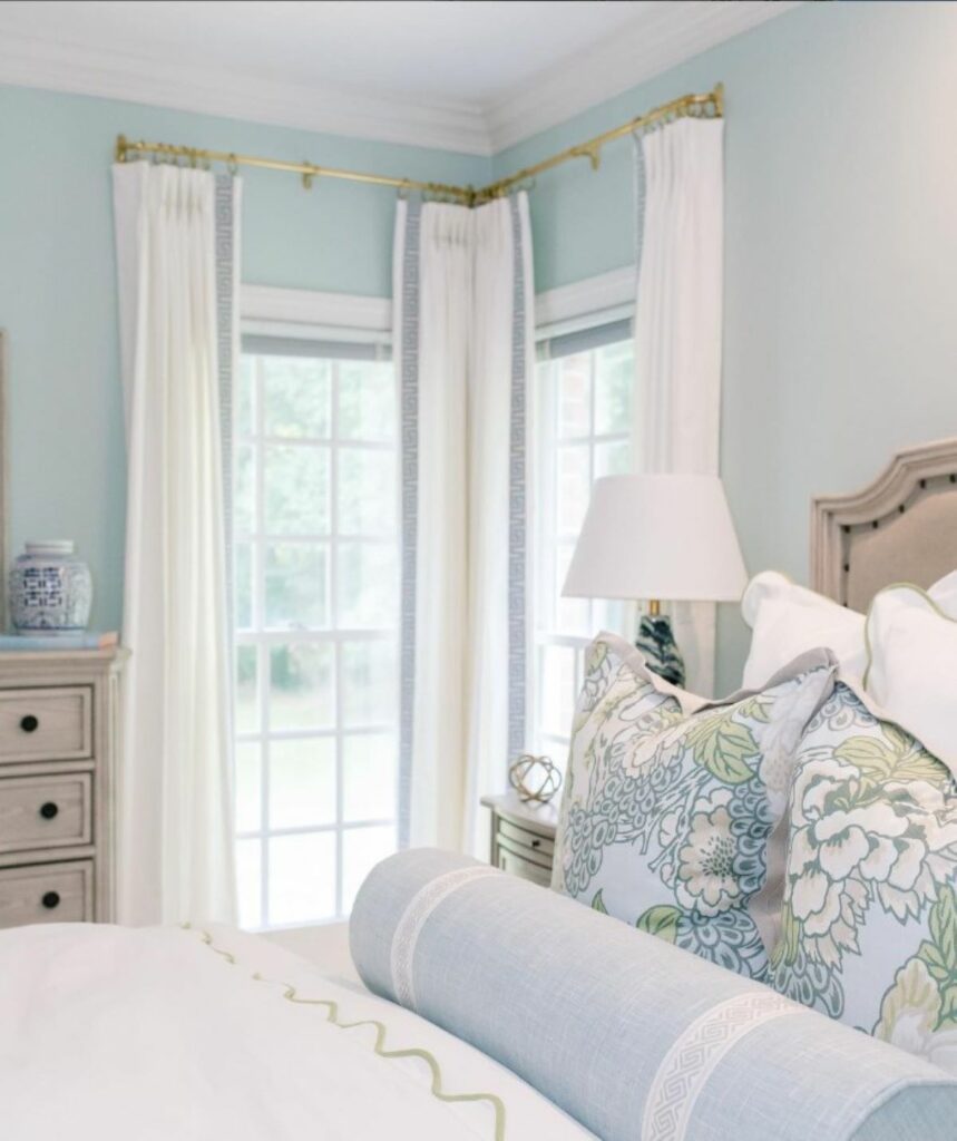
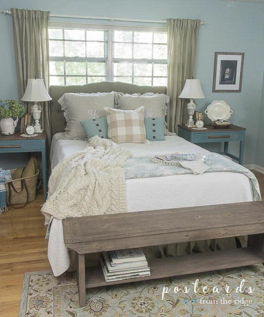
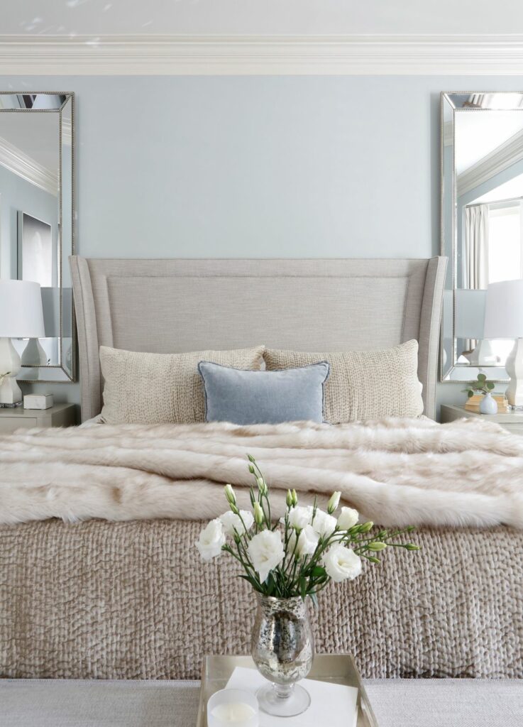
Palladian Blue by Benjamin Moore.
This blue has heavy green undertones. My other daughter’s bedroom was painted in this shade, and it was a gorgeous color!
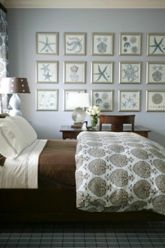
Silvermist by Sherwin-Williams.
A cool blue with slate gray undertones.
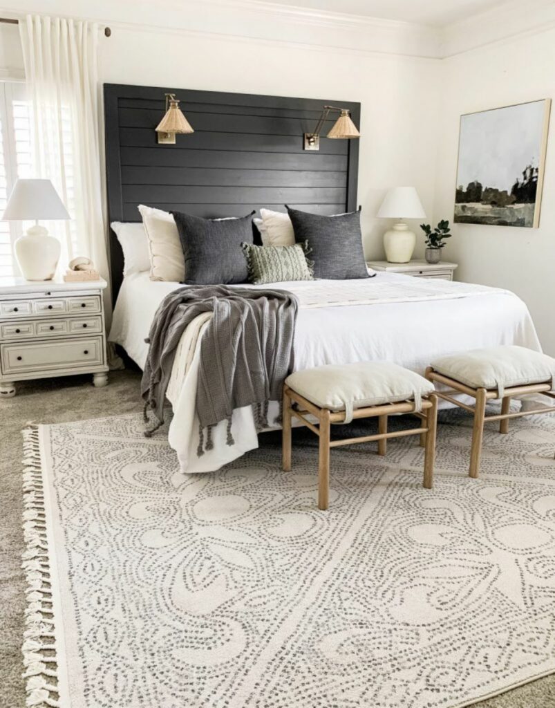
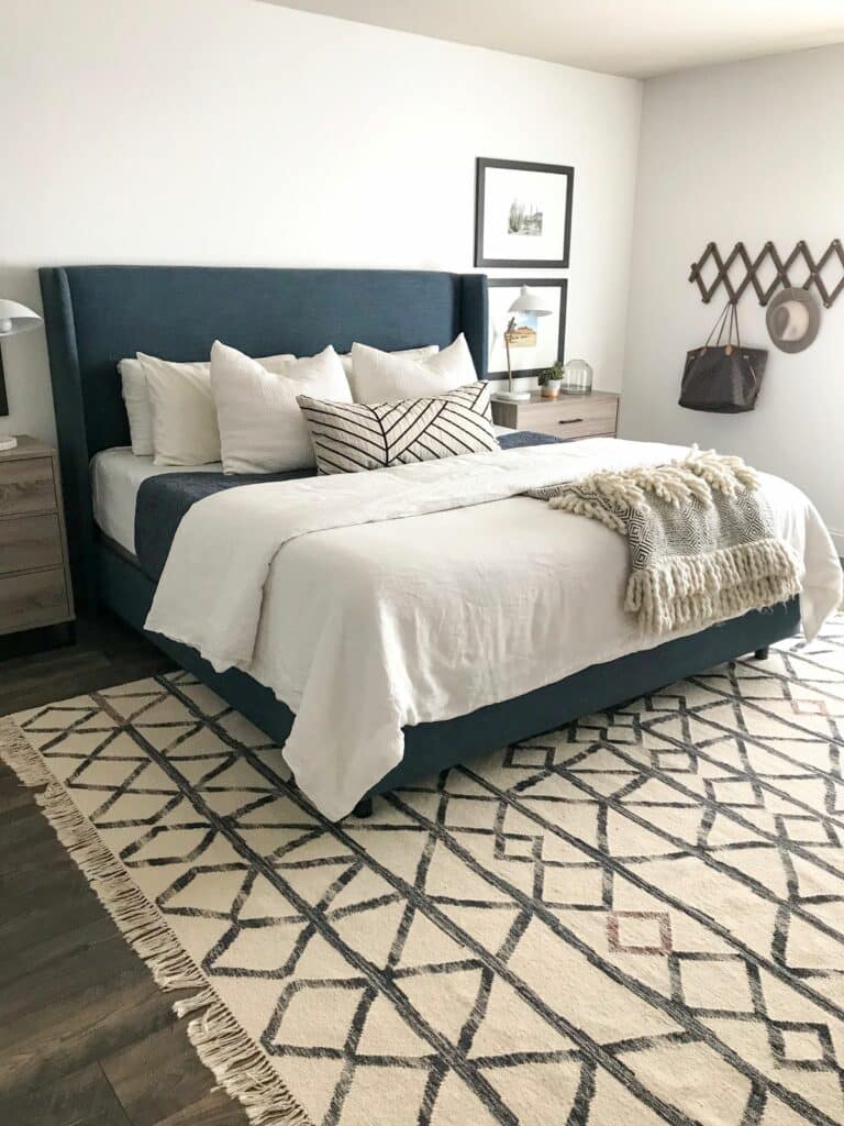
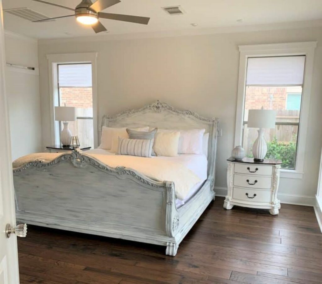
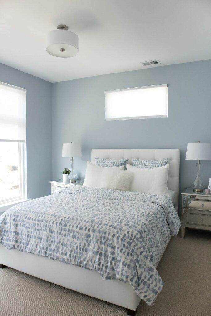
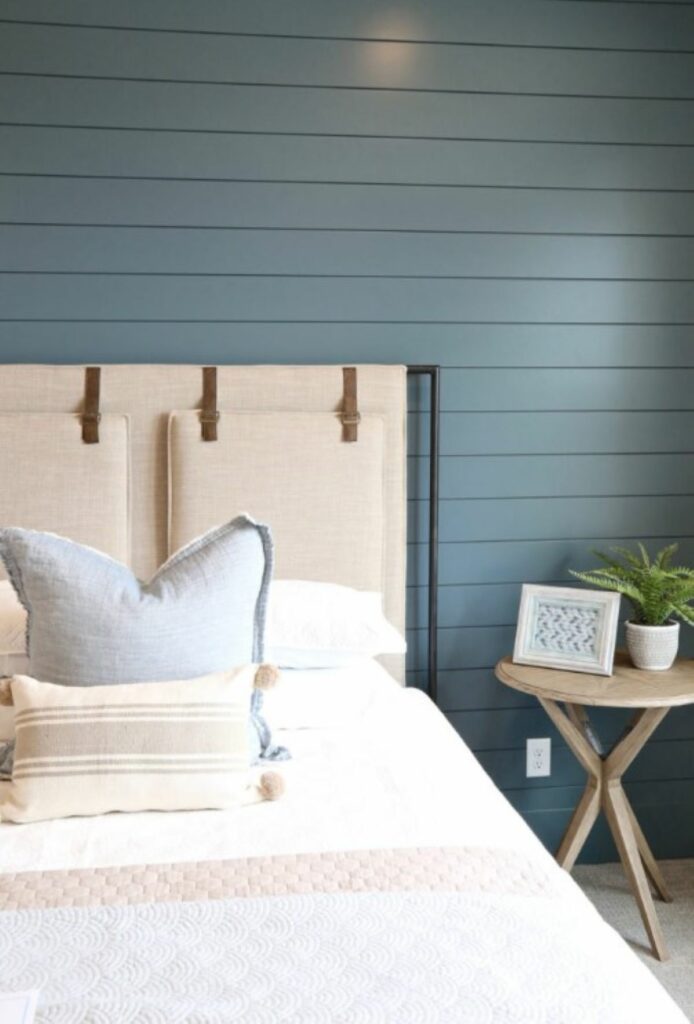
Krypton by Sherwin-Williams.
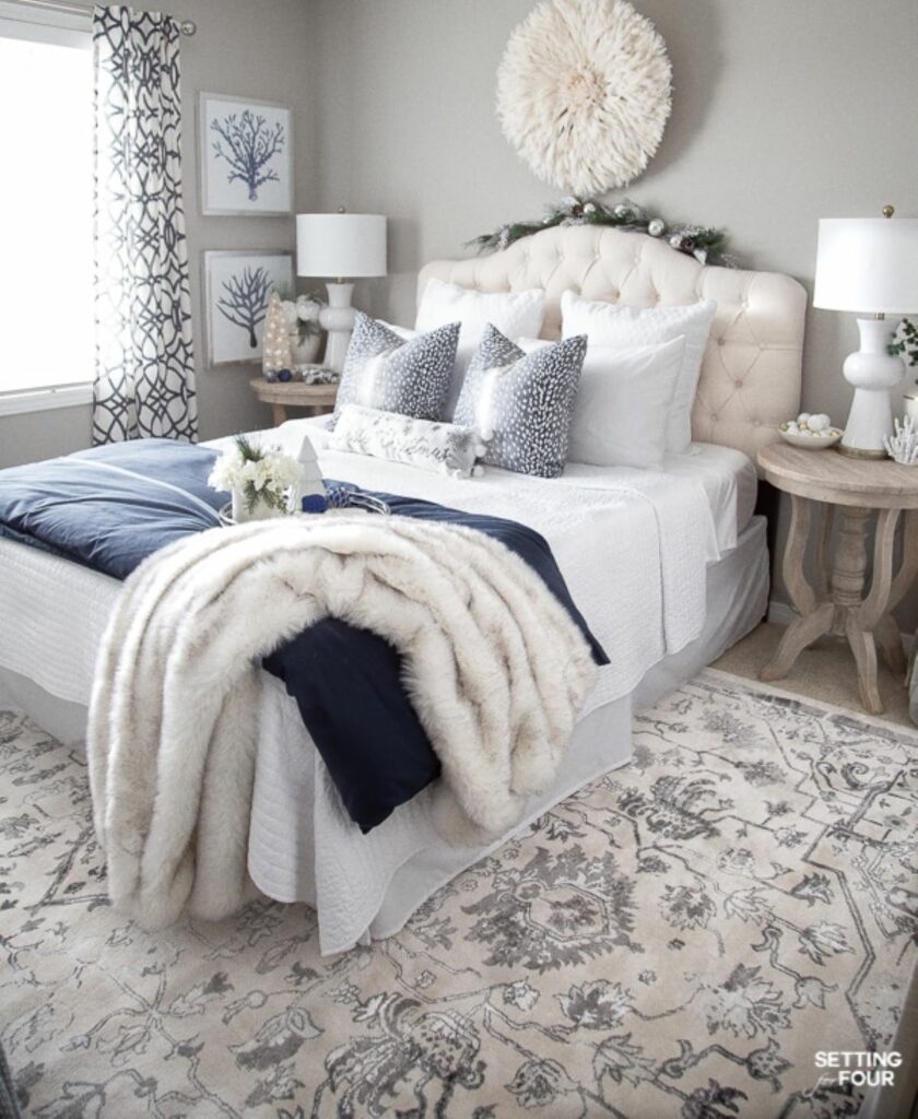
A very grayish neutral blue as seen in this guest bedroom:
Beach Glass by Benjamin Moore.
A grayed blue-green that brings the tranquility of the ocean.
Woodlawn Blue by Sherwin-Williams.
A soft blue-green with a hint of gray.
Van Courtland Blue by Benjamin Moore.
More of a medium, dusty blue from BM’s Colonial collection.
Smoke by Benjamin Moore.
While BM calls this shade gray, I’ve included it here for its heavy blue-green undertones.
Best greens for bedrooms.
Sea Salt by Sherwin-Williams.
This popular bedroom paint color is an excellent transition between our blue and green section, because of its heavy blue undertones.
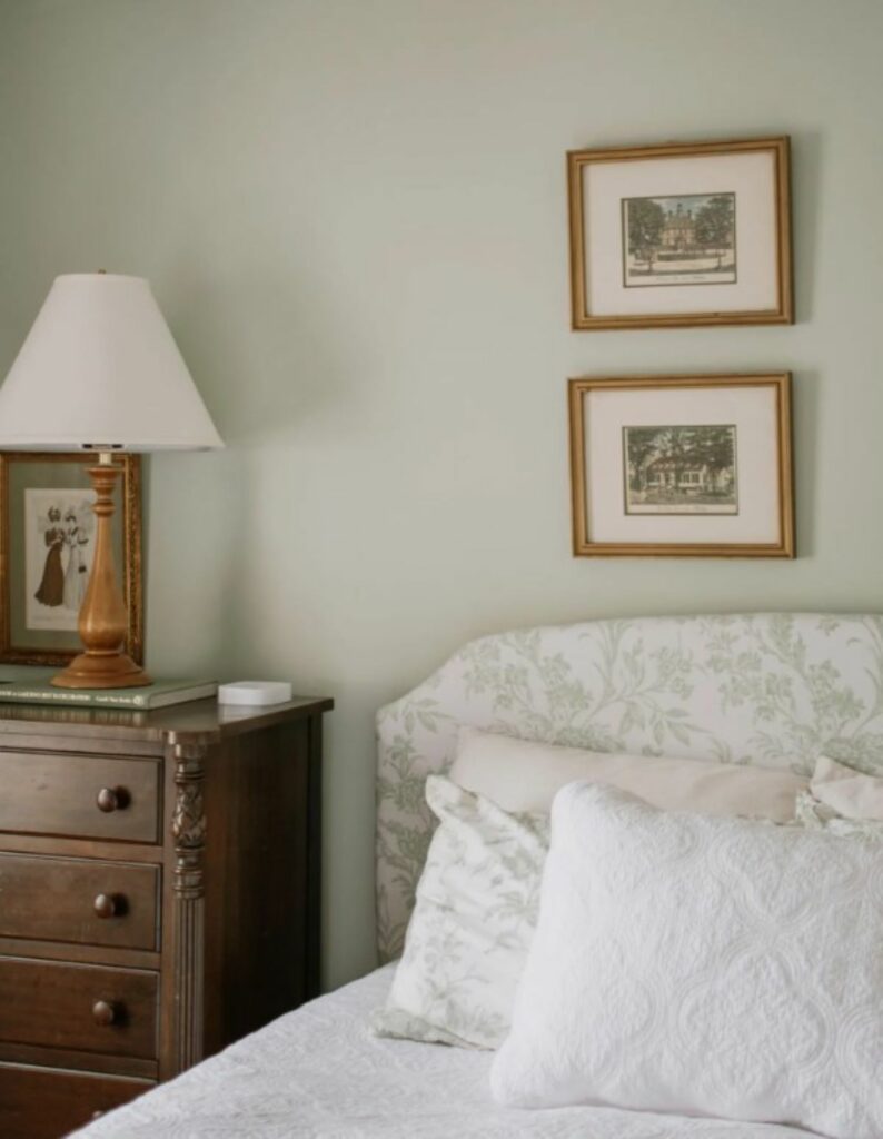
Ancient Marble by Sherwin-Williams.
I may be biased, but I’ve loved falling asleep and waking up to this soothing gray-green for the past eight years.
Hollingsworth Green by Benjamin Moore.
A beautiful combination of green with blue and gray undertones.
October Mist by Benjamin Moore.
A medium, warm, grayed down green.
Farrow and Ball French Gray.
This “gray” is a little misleading, because if you didn’t know the name, you’d swear it’s a muted sage green.
Light neutral paint colors for bedrooms.
Like white, neutral colors don’t shout for attention, and softly fade into the background. I’ve lumped together grays, tans, and the perfect combo of the two, greige.
SH&H Tip: It’s easy for gray paint colors to come off cold and blah concrete. Ground the gray with some warm wood furniture or flooring.
Best grays and greiges for the bedroom.
Agreeable Gray by Sherwin-Williams.
This light warm gray is so popular because well, it’s so darn agreeable. This greige looks good with almost any lighting and decor style.
Mindful Gray by Sherwin-Williams.
This warm gray goes a little darker, so make sure your room has lots of natural light.
Repose Gray by Sherwin-Williams.
As you can see, this “gray” is really a great neutral greige!
Silver Strand by Sherwin-Williams.
This lovely light gray with green undertones skyrocketed in popularity when it became a favorite of Joanna Gaines in Fixer Upper episodes.
Gray Owl by Benjamin Moore.
A cool, crisp, light gray hue.
Wickham Gray by Benjamin Moore.
A cool gray that’s part of BM’s Historical collection.
Stonington Gray by Benjamin Moore.
A silvery, neutral, medium gray. Make sure you have adequate light for this one.
Revere Pewter by Benjamin Moore.
If you’ve never heard of this popular paint color, you must not be into greige! This mid-tone gray can look just as tan, depending on the room. This was the basic color to sell houses before white took over.
Best tans and beiges for the bedroom.
Pale Oak by Benjamin Moore.
A light tan with heavy gray overtones.
Baby Fawn by Benjamin Moore.
A light, soft buff shade (sometimes just reading paint names makes me sigh…)
Balboa Mist by Benjamin Moore.
Another light greige or gray that I’ve thrown into the tans, because it could go either way, depending on the room.
Edgecomb Gray by Benjamin Moore.
This “gray” is so warm, I’ve also put this greige in the beige category.
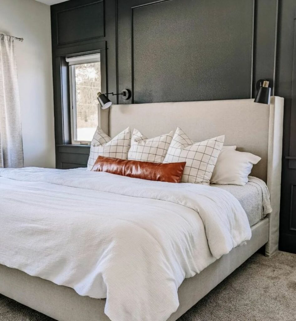
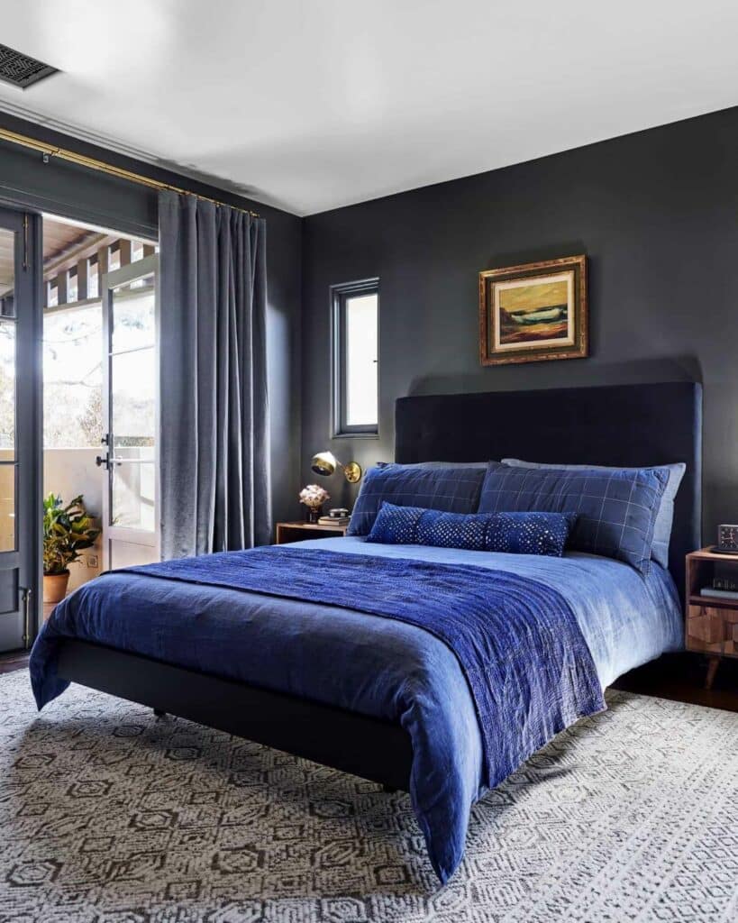
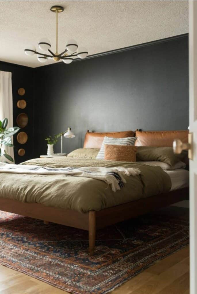
Best dark and moody paint colors for bedrooms.
Moody colors are having a moment. So to cozy things up and add some drama, try a daring darker color.
SH&H Tip: A dark color is usually best on an accent wall for drama, balanced by light walls, upholstery, and bedding. Painting the entire space may make the bedroom feel cave-like.
Evergreen Fog by Sherwin-Williams.
This glorious grayed-out sage green was SW’s color of the year for 2022.
Slate Tile by Sherwin-Williams.
A deep blue-gray shade.
Urbane Bronze by Sherwin-Williams.
A rich, deep dark, gorgeous brown.
Iron Ore by Sherwin-Williams.
A beautiful, almost black charcoal gray.
French Beret by Benjamin Moore.
A cross between the darkest gray and navy.
Hale Navy by Benjamin Moore.
A tried and true dark navy blue.
Tricorn Black by Benjamin Moore.
A true black with no real undertones. I’m not hip enough to paint my walls black, but I could go for this wonderful color for contrasting interior doors or trim.
Best yellow paint colors for bedrooms.
To keep these next colors restful, I’ve only chosen ones with a whisper of the tint. No bright, bold colors here.
Mannequin Cream by Benjamin Moore.
The perfect shade of pale yellow in my daughter’s room is neutral, but still feels so happy, like a yellow room should.

Steamed Milk by Sherwin-Williams.
This “white” comes off as yellow with peach undertones in the right lighting. SW “Creamy” is another good option that leans pale yellow.
Best blush and pink paint colors for bedrooms.
Precious pink may not be a color you’d think of for a master bedroom, but these two are heavenly for a feminine haven.
Intimate White by Sherwin-Williams.
If I had little girls again, they might finally get that all-pink room with this quiet, delicate pink.
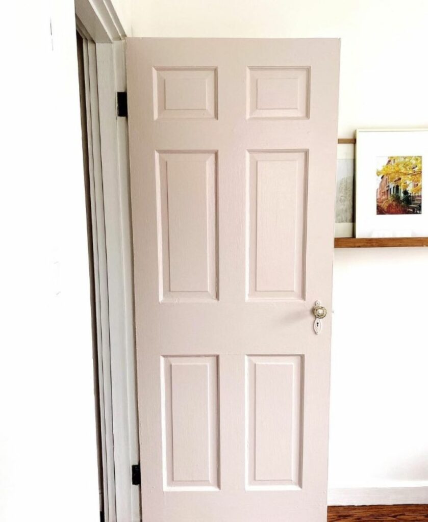
White Truffle by Sherwin-Williams.
A soft, dusty shade that makes this door so pretty in pink.
Best lavender paint colors for bedrooms.
You may think that lavender only belongs in nurseries and girls’ bedrooms, but these final two colors plead their case to go grown up.
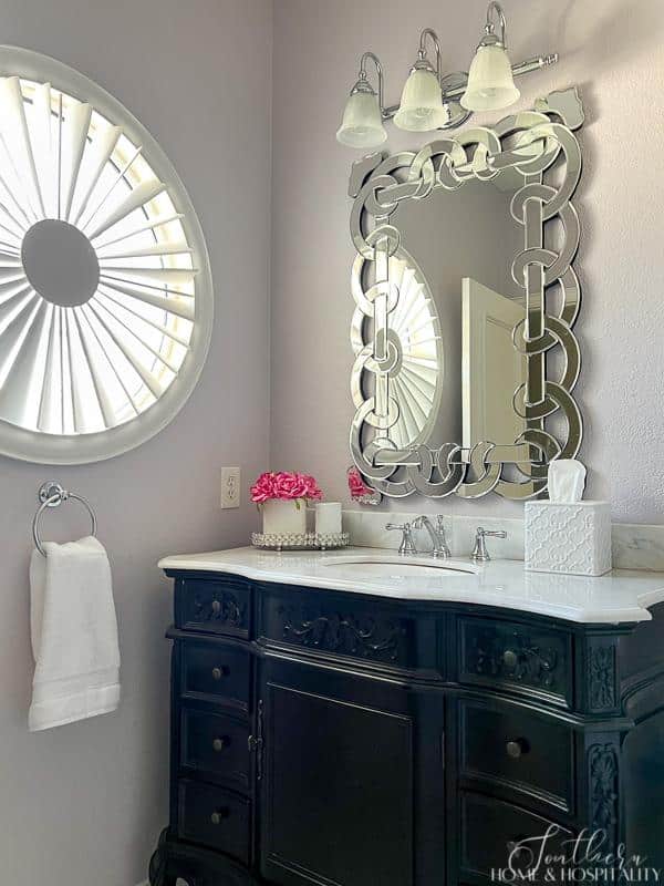
Slip by Benjamin Moore.
This muted lavender shade still looks appropriate in my adult daughter’s bathroom but would also be lovely in a bedroom.
Nosegay by Benjamin Moore.
This pretty purple is so pale, it’s almost white.
Things to keep in mind when choosing paint colors.
Look at the lighting in the room. Paint colors can look completely different depending on how much light the room gets, how large it is, what’s in it, and what direction it faces. And the same paint can look different in the same room during different parts of the day.
Make sure you’re happy with the sample during the darkest time and in the darkest areas of the room, where it’s most saturated.
Know the undertones. Every paint shade will have underlying color. Warm colors can have yellow, pink, or peach undertones, while cool colors may have purple, green, or blue undertones.
Tips
To help you find the undertones:
- Lay the sample card on a white sheet of computer paper
- Look at the darkest shade on the paint sample strip
- Look up the color description on the paint manufacturer’s website
PAINT the sample. Don’t ever choose paint without sampling on your actual walls. Paint manufacturers now sell small test containers just for this purpose.
Tips
Never choose a paint solely based on:
- What it looks like in someone else’s house. It will look different in your house.
- What it looks like on the internet. Online photos are often lightened and edited to make them more eye-catching. (Case in point—a reader thought the outside of my yellow house was white)
- What the tiny cardboard sample swatch looks like. You can’t get the feel for the undertones at all.
Know how the paint finish will change the color. A matte, eggshell, satin, or glossy finish can affect the way the color looks. The color in a gloss paint will appear brighter (and show more imperfections).
Know that the colors will almost always appear darker and more saturated than you expect, especially in bedrooms where there isn’t typically as much natural light.
My tip for making sure the color is soothing rather than too saturated? Go in between. My bedroom color is 150 percent SW Ancient Marble, putting it in between that shade and the next darker, Grassland.
I hope you’ve found the perfect paint color in this list to make your own peaceful retreat. One that wraps you in a comforting blanket of zen in the safe, stress-free space of your bedroom.
Now if only the dog could give foot massages…

Before you go:
As always, I appreciate your visit, comments, and shares here on the blog! I’d love it if you also follow along with me on Pinterest, Instagram, and Facebook so you won’t miss any of my inspiration and ideas.
Don’t forget to sign up for updates to keep in touch.
If you’re not already a member of the SH&H family, I’d love to have you join me! You’ll not only get email updates, but you’ll have exclusive access to all the bonus materials in my free subscriber-only library, like this:
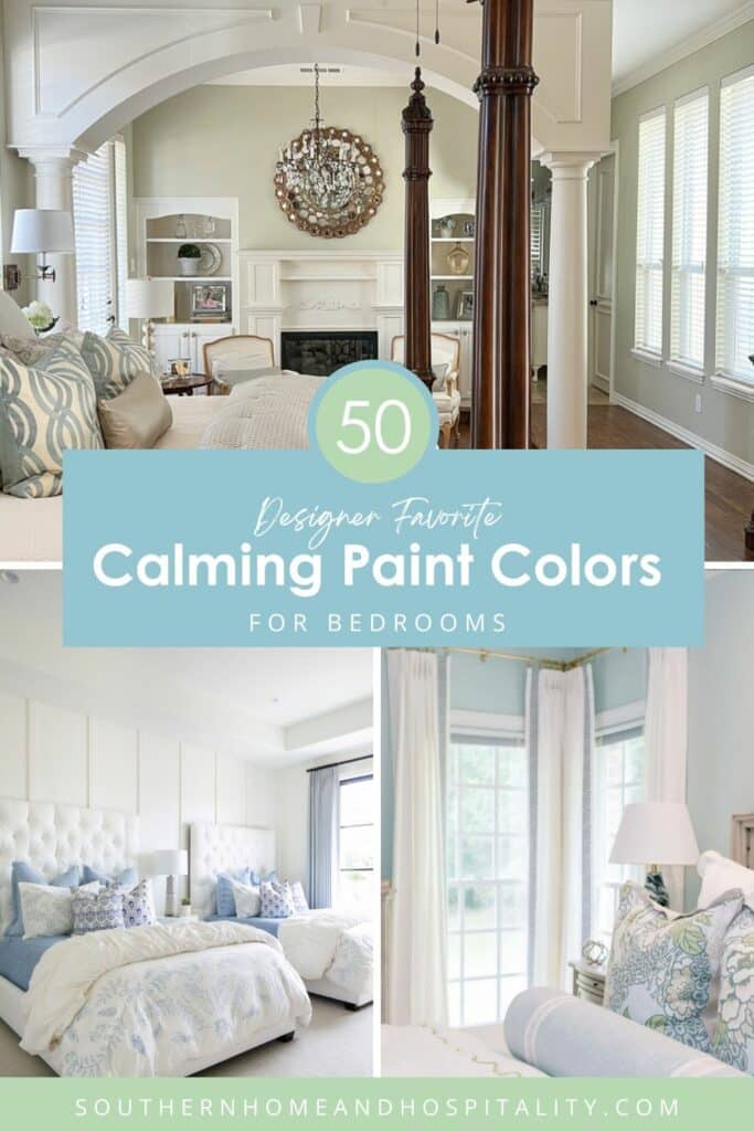
Pin it to remember it!
If you’ve enjoyed this post, please pin and share this on Pinterest:
This post contains Amazon and other affiliate links for your convenience. As an Amazon Associate I earn from qualifying purchases. If you purchase something through any link, I may receive a small commission, at no extra charge to you. I only recommend products that I love or would purchase for myself. See my full disclosure here.
Sources for this post.

Great job showing and describing the colors!
Thank you so much Amy!
Beautiful rooms!!!